Read through the blog here, or skip to Jason’s October 2023 Market Update video below.
2023 began with solid market performance among major indexes as investors put the 2022 bear market in the rear-view mirror. The AI technology rally certainly captured investor attention, which led to the formation of a new bull market. Despite the March regional banking crisis that tested markets and investor fears, they largely brushed it off, and by April, most indexes resumed their uptrend.
Bond Markets in Q3 2023
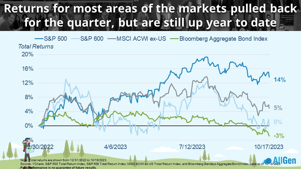
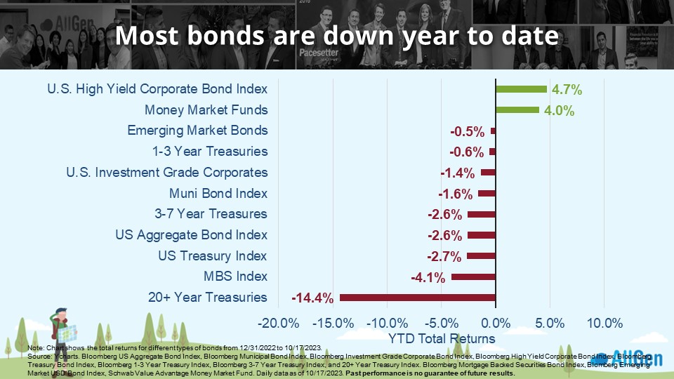
Now that we’re three-quarters through 2023, it’s safe to say that markets are reacting to a new basket of worries. Here’s where markets stand in the chart below as of Oct 18, 2023. Although we’ve seen the market pullback in Q3, stocks remain positive year to date. Yet, bonds are a different story – they are now down -3% year to date after spending most of the year positive.
Technical Analysis of Market Uptrends
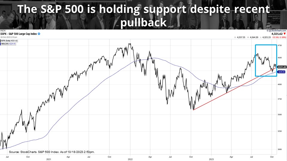
We regularly use technical analysis when researching markets which helps analysts take recent market movements into perspective. The red line below represents technical support levels where we can clearly see the S&P 500 is testing the red upward trendline and the blue 200-day moving average. We’re closely watching how markets behave over the next few weeks as we enter a historically strong time of year for markets.
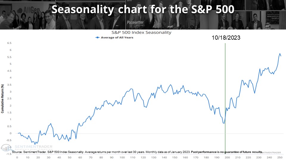
Market Seasonality Analysis
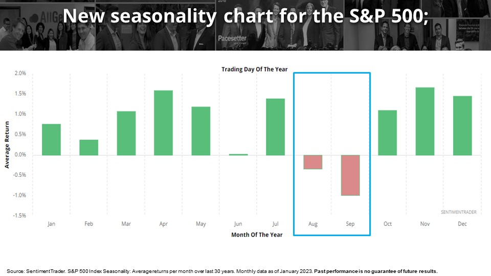
A fascinating concept to analyze is market seasonality. The first bar chart below takes the average return of each calendar month over the last 30 years. Each bar represents the average return of the S&P 500 for its respective month. Notice the months that have historically performed poorly (August and September) and the months following. So far, the S&P 500 has followed the same pattern by posting negative returns in August and September for 2023. Illustrated another way in the following line chart, we can visually see that over the last 30 years, markets have performed poorly in the late summer months but tend to strengthen through the fall season. Obviously, historical returns are not predictive of the future, yet they can still offer perspectives into markets and investor sentiment.
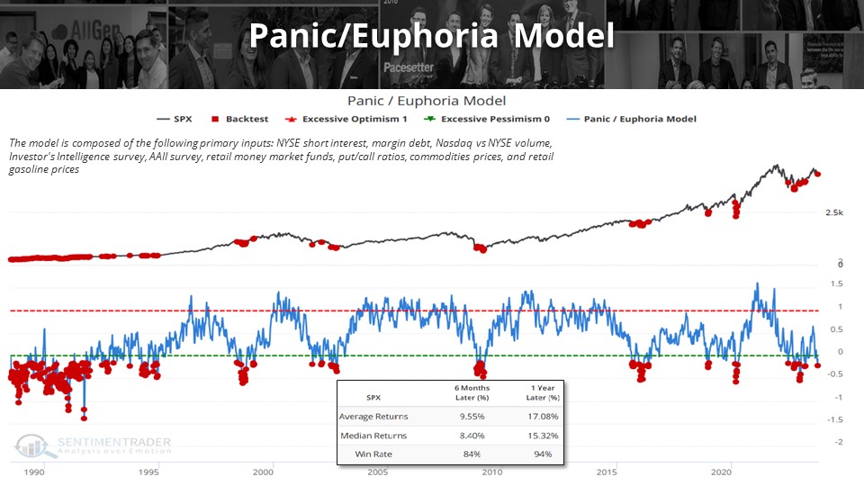
Investor Sentiment and Investing Opportunities
Market sentiment refers to investors’ attitudes towards markets. The Panic/Euphoria Model combines several different indicators into one, such as margin debt, NYSE volume, put/call ratios, investor surveys, and several others. Simply put, when the blue line is low, investors are panicked and when the blue line is high, investors are euphoric. We’re big fans of backtest engines, which can help us understand how markets have behaved in the past when sentiment becomes overwhelmingly negative. Over the last 33 years, the Panic/Euphoria Model has reached extreme pessimistic levels numerous times as seen below. When the indicator reaches extreme pessimism, returns in the S&P 500 over the next year were positive 94% of the time and averaged 17.08% growth. While this does not argue that future returns will be positive, it simply offers perspective for the rational investor.
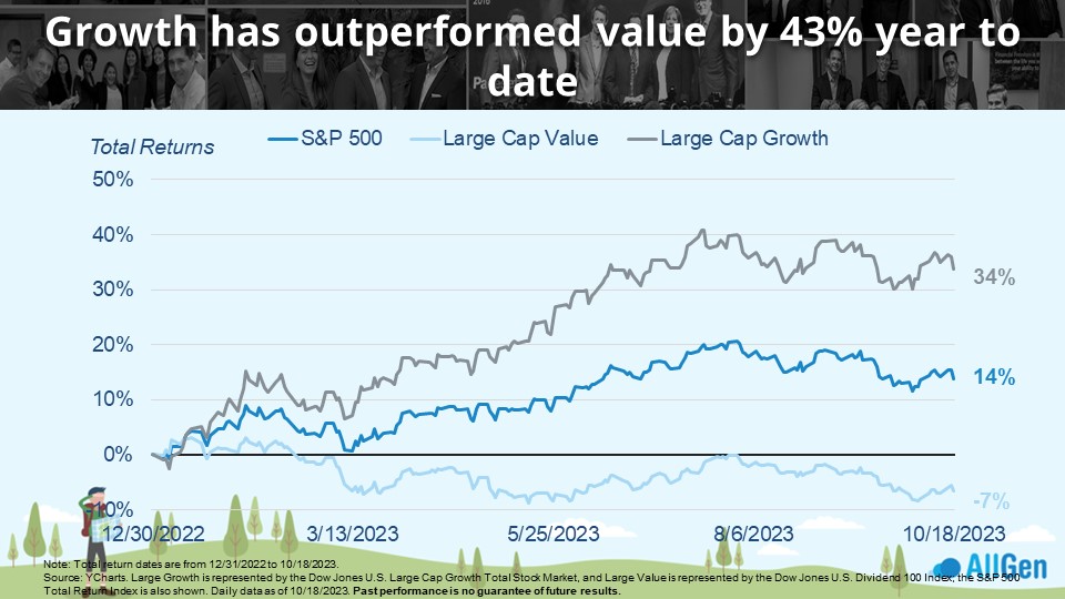
Growth Stocks and AI
Largely nicknamed the “AI tech rally,” the first two quarters of 2023 saw major outperformance in growth stocks. Remember that growth stocks are typically technology companies with growing profits, whereas value companies are typically defensive companies with steady profits. Large Cap Growth is still up 34% for 2023 as of 10/18 whereas value companies have struggled and are down 7%. While 2023 has so far been a great year for growth stocks, 2022 was not, where value stocks significantly outperformed. AllGen takes a balanced approach between growth and value stocks and rebalances over time.
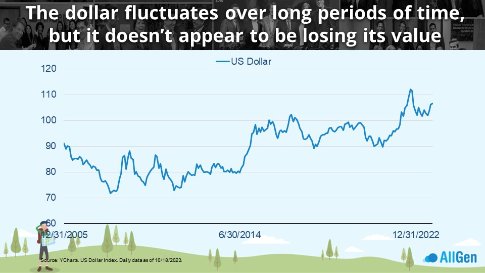
Strong Dollar Despite Inflation
Investors are no strangers to the obvious pain inflation has caused recently. However, although inflation has been elevated, the dollar has been strengthening, which might be confusing. To clarify the difference, when referring to the strength of the dollar, we are comparing its value against a number of other world currencies and the policies of other central banks around the world. Since 2008, the dollar has strengthened, as seen below. The strength of the dollar is highly correlated with interest rates, meaning that if interest rates on the dollar are higher than other currencies, investors typically tend to seek investments in dollars. Inflation measures the purchasing power the dollar has against local goods and services.
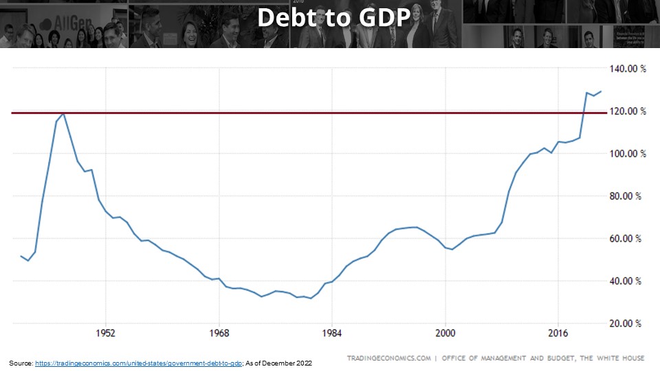
U.S. Debt Compared to GDP
This has been a busy year for U.S. lawmakers as Congress faced a myriad of issues we won’t debate here. We will, however, use a chart to compare U.S. Debt to GDP. We cannot compare current debt levels to historical debt levels because of inflation, but we can create a ratio by dividing it by the U.S. GDP. Although the U.S. debt is much higher than it was in the 1940s, if we divide it by GDP we find that we have now surpassed debt/GDP levels not seen since World War II. A lower debt/GDP ratio indicates a healthier economy and vice versa.
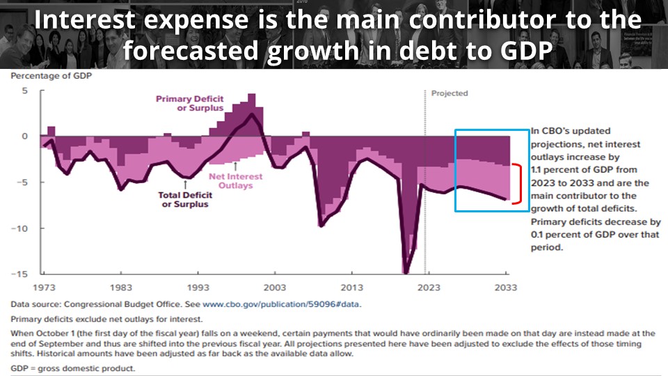
Interest on Debt and Deficit Contributions
Now that there’s income in fixed income, investors are finally able to earn higher yields on bonds, but how does this relate to the U.S. deficit? In simple terms, a deficit is created when one spends more than one earns; the difference would be the deficit. Focusing on the right side of this chart, the light purple area represents net interest outlays: the interest the U.S. Government must pay on its treasuries. We can clearly see that the deficit has been expanding (the black line moving down), along with the interest expense the government must pay to service this debt.
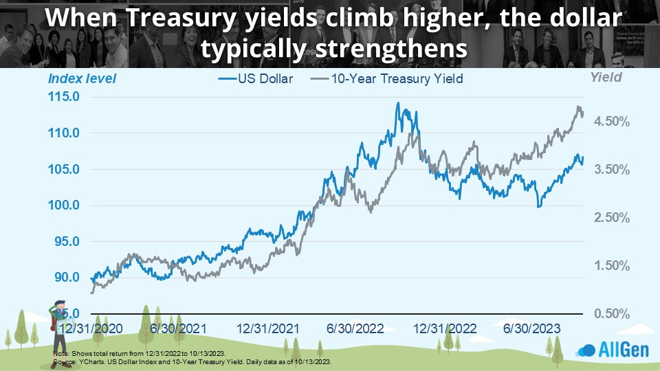
Treasury Rates and a Strengthening Dollar
The Federal Reserve has spent most of the last 18 months raising interest rates to levels not seen in the last 15-20 years. When interest rates rise, it can attract investors to that currency – further strengthening the currency, like the dollar in the below example. We can see in the chart below that the strength of the dollar (the dark blue line) moves in line with 10-year treasury yields (the gray line).
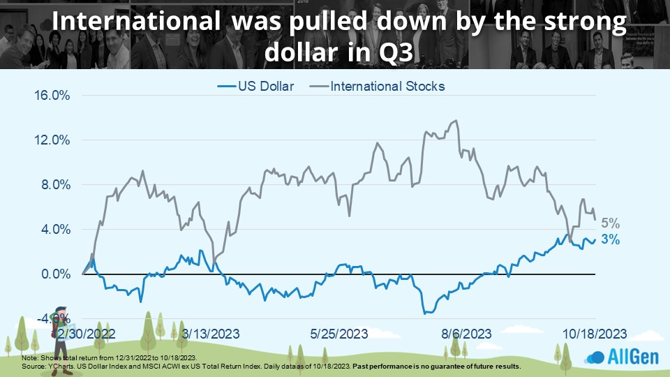
The Dollar and International Stocks
On the flip side, if the dollar is attracting investors, it typically means it’s pulling investors from international markets which tend to underperform. As shown below, when we compare the strength of the U.S. Dollar to the international stock index, we find that international stocks typically underperform and are rather negatively correlated.
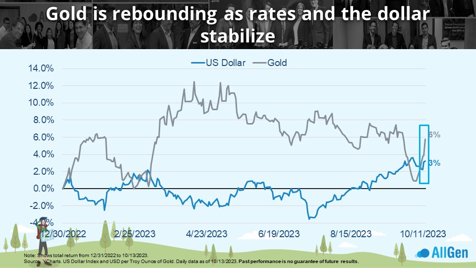
The Price of Gold and the Dollar
Additionally, gold (the gray line below) also tends to move in opposite directions to the dollar (the dark blue line). If we focus on the far right, we see a rare occurrence where the price of gold and the strength of the dollar move in the same direction which typically occur during times of geopolitical tensions and times of extreme uncertainty. Currently, the situation in Israel is thought to be contributing to investors’ rush to safety, which typically includes precious metals like gold.
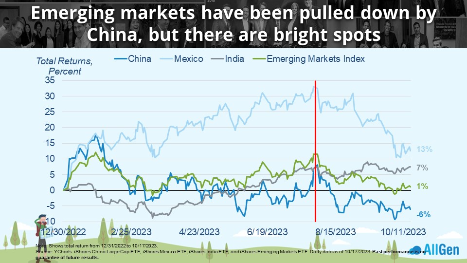
Not All Emerging Markets Are Equal
Circling back to international stocks and how they typically underperform U.S. stocks as the dollar strengthens, emerging market stocks tend to also struggle. The vertical red line represents when the dollar began strengthening near July 2023, and although they’ve pulled back since their mid-year highs, there are other factors at play worth noting.
Emerging Markets in China and Mexico
Emerging markets represent developing countries, currently led by China. There’s no doubt that the global pandemic of the early 2020s is still in the back of everyone’s memories. I can specifically recall China’s zero-tolerance policy on COVID-19 and the tremendous shortage of exported goods. Just in the last year, China has begun to relax some of its policies. However, companies have already been looking elsewhere, like Mexico and other places physically closer to the end consumer. Just this year, Mexican stocks (the light blue line) have rallied 13% as of 10/17/2023, down from their July high of nearly 33%! China on the other hand (the dark blue line) is down -6% and has spent most of the year struggling to maintain positive returns.
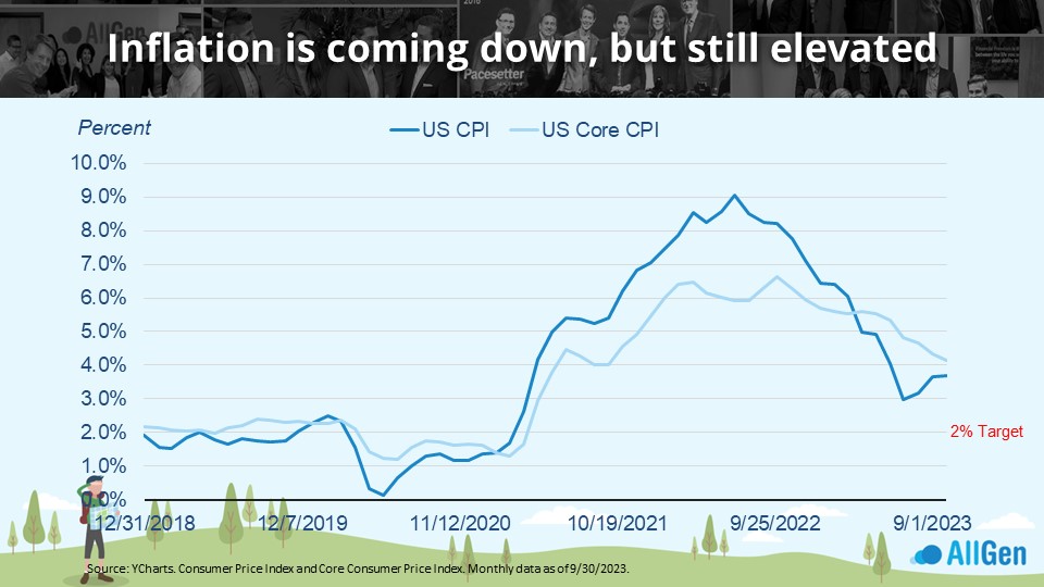
Easing Inflation Remains Above Targets
While total U.S. inflation and core inflation have been trending down since mid-2022, they’re still stubbornly above the fed target of 2%.
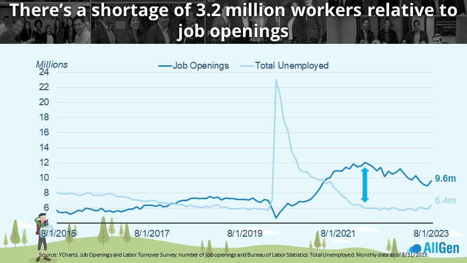
The current labor market contributes largely to the elevated inflation we’ve seen in recent months but shows signs of easing. In early 2022, as indicated by the up/down arrow below, the gap between job openings (in dark blue) and people looking for jobs (in light blue) was nearly 2:1 meaning that for every two job openings, there was only 1 person looking for a job. Now, we’re seeing the gap between job openings and job seekers closing and although that could help reduce inflation, we are still far from the target.
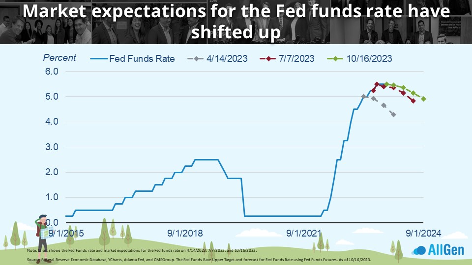
The Fed’s Stance: Higher Rates for Longer
We continue to point out that we have witnessed one of the most aggressive rate hiking schedules in history as the Federal Reserve desperately tries to fight inflation by increasing interest rates to slow the economy; remember that higher interest rates slow the economy, and lower interest rates stimulate the economy. Markets have largely underestimated where rates would peak and begin to decline again. According to the CME Group, back in April of 2023, markets thought rates would peak at 5% and begin to fall shortly afterward, which has not been the case. Interest rates continued to increase despite market expectations. Now that the Fed has signaled a pause in raising rates while also indicating higher interest rates for longer, markets are still expecting eventual rate cuts even though the Fed has hinted that one more rate hike could still be on the table. Bond prices typically move inversely to interest rates, which could mean that opportunity is on the horizon for bonds – something we’re keeping a close eye on.

Bond Prices Versus Bond Yields
As seen below, bond prices (the blue line) move inversely to bond yields (the gray line), which can offer insight that we might be at the end of the most aggressive rate hiking cycles on record, along with the worst bond-performing market on record. Now that interest rates appear to be peaking, which has pulled down bond prices to historical discounts, there could be a reason to begin adding to bonds.
Diversification and Target Allocations
AllGen manages diversified portfolios and adjusts target allocations based on market conditions. Throughout 2022 and 2023, AllGen has maintained an underweight to longer-term bonds, which are typically more price-sensitive to changes in interest rates. Based on the potential opportunity we’ve been monitoring, we have been slowly increasing the position. It’s extremely difficult to predict exactly when the bond market might turn the corner, which is why portfolio managers make adjustments in stages. Currently, we’re utilizing a barbell approach where, along with the rest of our fixed-income portfolios, we hold a higher amount in money markets (low duration/less sensitive to interest rates) and longer duration bonds, which should perform better when interest rates decline.
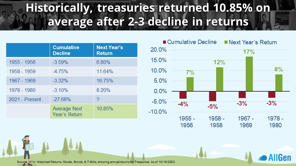
Money Market Funds and Treasury Returns
Historically, after 2+ consecutive years of negative bond returns, treasuries return 10.85% on average. This happened four times since 1955, when treasuries saw higher returns following a long drawdown. Notice that while money market yields are currently paying enticing yields, around 5.2%, each bond market recovery far exceeded these returns. While we cannot predict exactly when a recovery will occur, we are continuing to position portfolios by holding healthy amounts of stable money market funds, while adding to treasuries.
Summary
- Both stocks and bonds have pulled back in Q3 3023, which has improved valuations.
- Inflation is trending in the right direction but remains elevated above the Fed 2% target.
- Odds favor the Fed funds rate peaking and dropping sometime next year
- Bottom Line: If you are holding extra cash above your emergency reserves, we would consider redeploying into the market in accordance with your risk profile.
If you’re wondering how investing strategies can apply to your financial situation, talk to an advisor here!
For more information, watch the full October 2023 Market Update video below.
Important Disclosures: The information provided here is of a general nature and is not intended to answer any individual’s financial questions. Do not rely on information presented herein to address your individual financial concerns. Your receipt of information from this material does not create a client relationship and the financial privileges inherent therein. If you have a financial question, you should consult an experienced financial advisor. Moreover, the hiring of a financial advisor is an important decision that should not be based solely upon blogs, articles, or advertisements. Before you hire a financial advisor, you should request information about the financial advisor’s qualifications and experiences. Past performance is no guarantee of future results. All expressions of opinion are subject to change without notice in reaction to shifting market conditions. Data contained herein from third party providers is obtained from what are considered reliable sources. However, its accuracy, completeness or reliability cannot be guaranteed. Examples provided are for illustrative (or “informational”) purposes only and not intended to be reflective of results you can expect to achieve. AllGen Financial Advisors, Inc. (AllGen) is an investment advisor registered with the SEC. AllGen does not provide personal financial advice via this material. The purpose of this material is limited to the dissemination of general information regarding the services offered by AllGen. The Disclosure Brochure, Form ADV Part II, which details business practices, services offered, and related fees of AllGen, is available upon request.


