Read through our market commentary here, or skip to Jason’s April 2023 Market Update video below.
Investing can be exciting and even thrilling; some even say it’s like riding a rollercoaster. But like most thrill rides out there, they all come with their ups and downs. For those that followed the markets since the Covid-19 Pandemic of 2020, this metaphor might resonate with you!
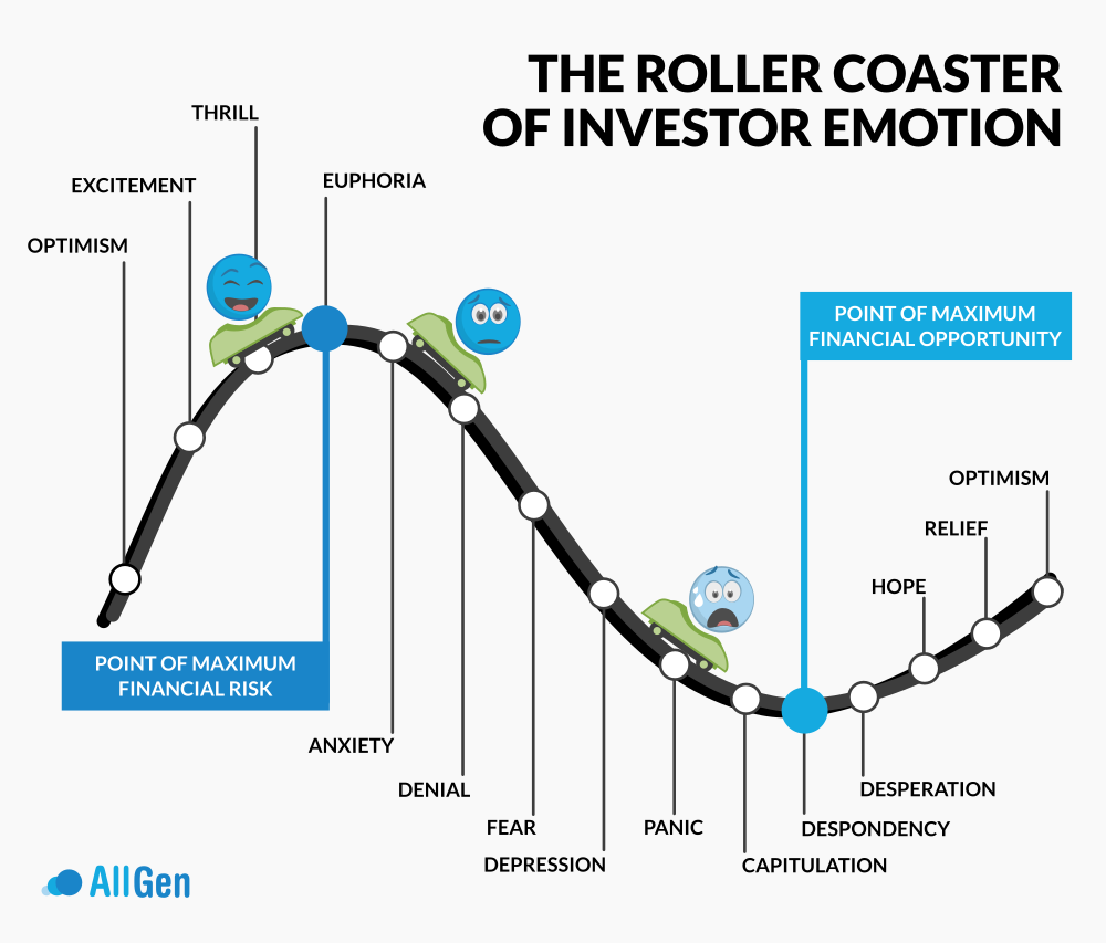
Investor Sentiment and the Roller Coaster of Emotion
The chart below illustrates the emotional rollercoaster investors may have felt. As markets climb to higher highs, more investors enter the market to seek the thrill. Investors’ optimism turns into excitement, success stories begin to appear everywhere, and eventually, euphoria sets in where seemingly nothing will stop the climb! At this point, most investors are already in the market, which suggests the market is at the point of maximum financial risk since there are more potential sellers than there are buyers. We believe markets arrived in the euphoria stage around November of 2021. The next stage begins with market volatility where investor anxiety sets in which leads to denial. Headlines turn from positive to overwhelmingly negative, further fueling market fears. Ultimately, this cycle ends with panic, extreme pessimism, and ultimately capitulation and despondency where investors quit and sell. At this stage in the emotional rollercoaster, there are more potential buyers than sellers in the market which indicates maximum financial opportunity and usually occurs when investors are most scared, typically contrary to popular opinion.
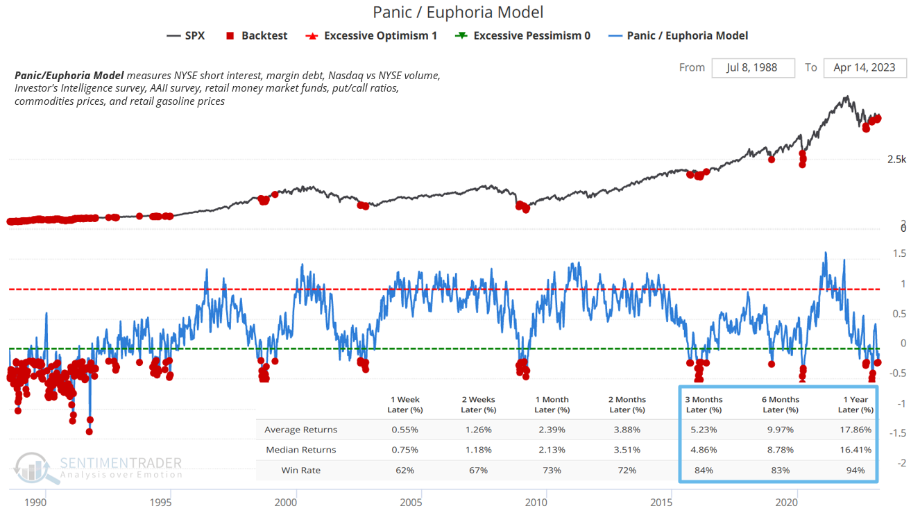
Investor sentiment is something we monitor heavily and has historically offered guidance on where opportunities may lie. The Panic Euphoria model measures short interest, Put/Call ratios, and investor sentiment surveys, to name a few. In the chart below, we compare historical timeframes when the Panic Euphoria Model (blue line) became very low (extreme pessimism) with the S&P 500 Black line. If an investor were to buy shares of the S&P 500 every time the Panic Euphoria model reached extreme pessimism (at every red dot), they would have returned 17.89% on average, 94% of the time, one year later.
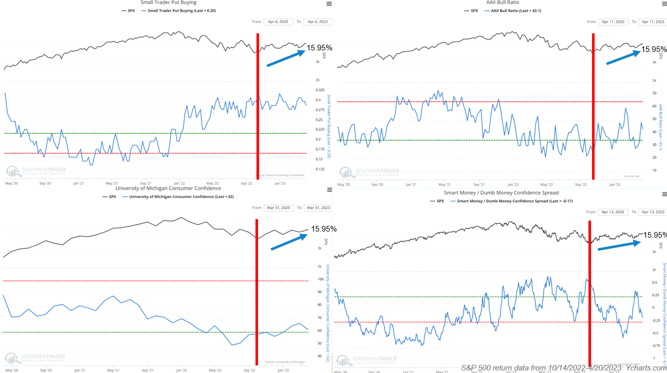
The Panic Euphoria Model was not the only indicator that triggered a buy signal in October of 2022, in fact, several others did as well. Below are four other sentiment indicators: Small Trader Put Buying, University of Michigan Consumer Confidence, AAII Bull Ratio, and Smart Money/Dumb Money Confidence Spread, all of which pointed to potential opportunities. The S&P 500 is up 15.95% since October 2022 (red vertical bar).
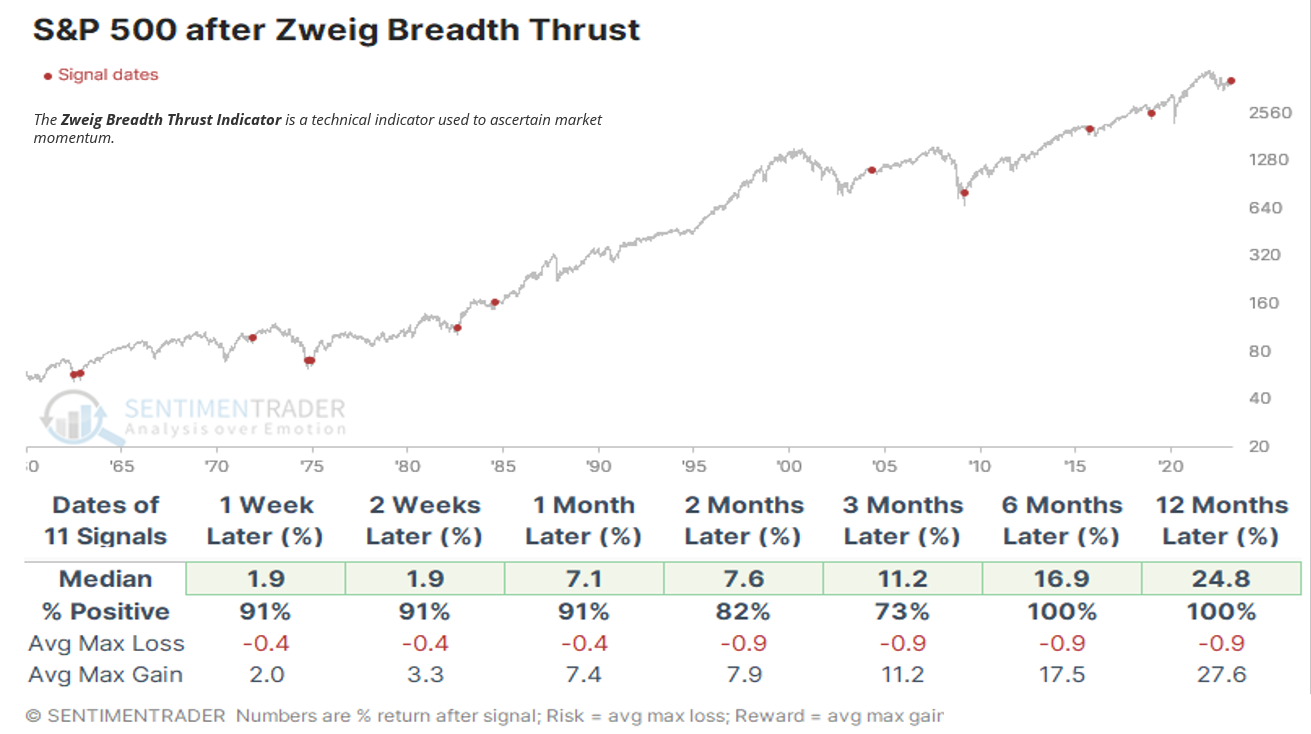
Market Breadth and Market Opportunities
Additionally, market breadth has pointed to potential market opportunities. Market breadth measures market momentum: A buy signal indicates that more stocks in the index are contributing to upward performance. Tracking since the 1980s, the average return for the S&P 500, 12 months after this indicator triggered a buy signal was 24.8%! This is of course no guarantee that the next 12 months will return double digits, it rather offers a rational perspective that, in addition to sentiment research covered earlier, market breadth is also supporting opportunity in markets.
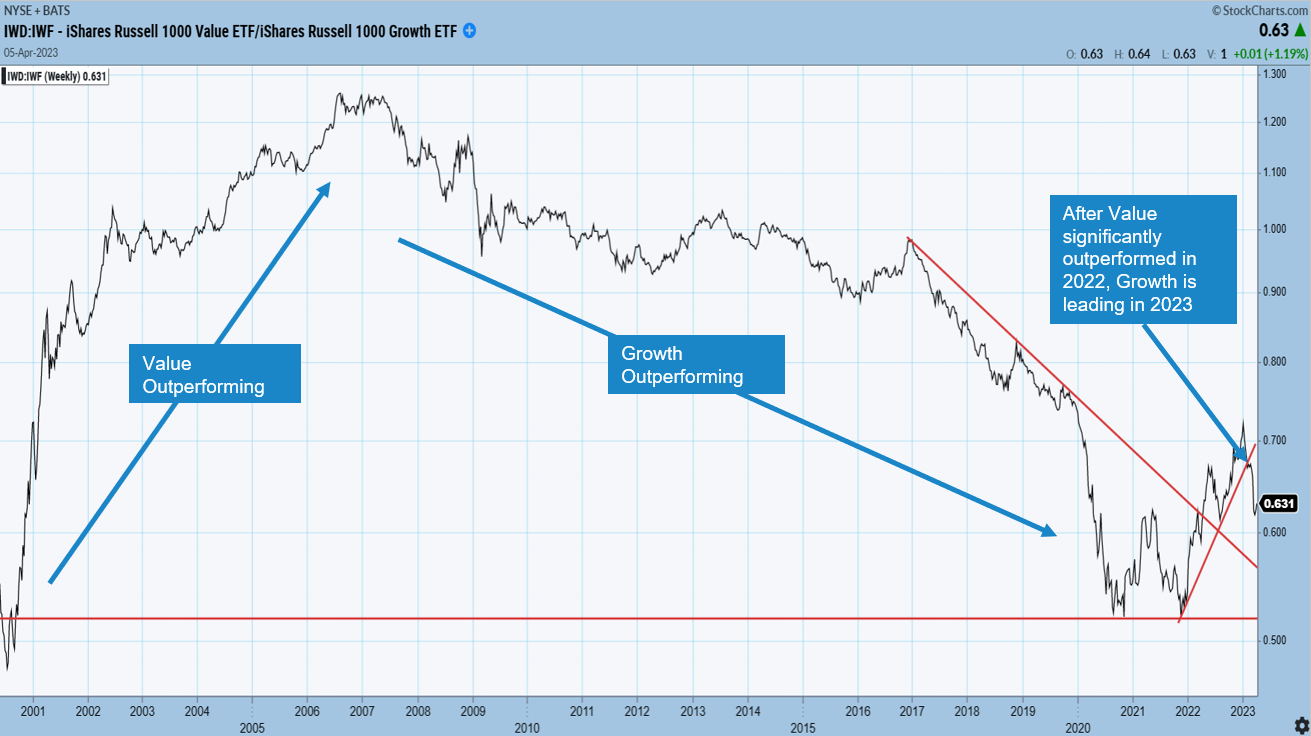
Value Stocks vs. Growth Stocks
The next few charts have appeared in past market updates and cover important relationships we monitor closely. The below chart measures the outperformance of value vs growth stocks. As the line trends down, growth stocks are outperforming and vice versa. Growth stocks, for example, technology companies, are also interest rate sensitive, given they typically have weaker cash flow, which makes them more reliant on cheap borrowing costs (lower interest rates). For most of 2022, growth stocks experienced significant underperformance as interest rates rose (cost of borrowing increased). Value stocks usually have stronger cash flows and are less hurt by rising borrowing costs. Now that the Federal Reserve has announced they will slow their aggressive rate hiking schedule and keep rates steady for 2023, growth stocks have begun leading value stocks in 2023. Although the Fed has not actually begun reducing interest rates (lowering the cost to borrow), markets anticipate the future which can cause prices to move early. AllGen began 2022 with an overweight position in value stocks which helped client portfolios and has since added to growth in early 2023.
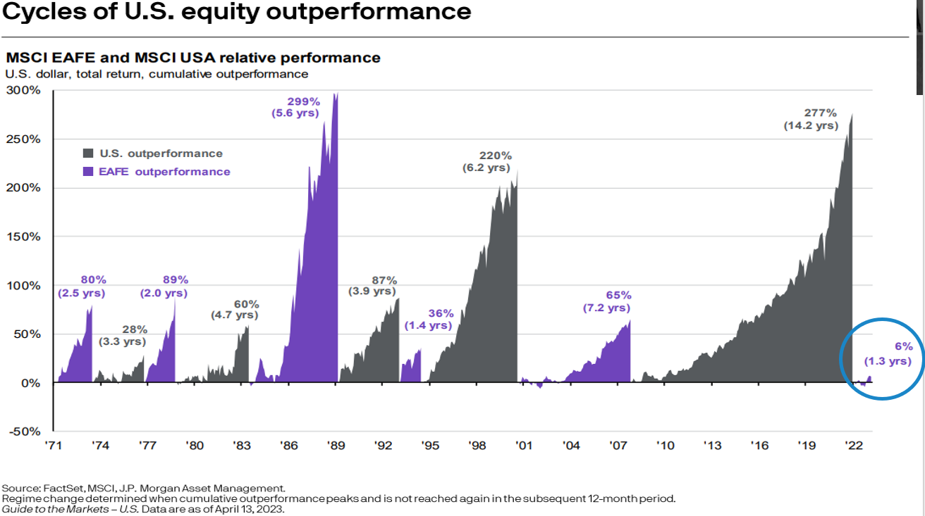
The Relationship Between Stock Underperformance and Outperformance
The underperformance/outperformance relationship can be used when comparing any two different investments. Note how in the previous chart, value stocks outperformed growth stocks for several years before growth stocks began outperforming for the next several years like the way a pendulum slowly swings from one side to the other. These cycles of outperformance also appear when comparing US stocks to international stocks depicted in the mountain chart below. Dating back to the 1970s, US stocks and international stocks have had respective periods of multi-year outperformance. Since 2008, US stocks (gray mountain) have outperformed international stocks however, just in the last year, the pendulum appears to have shifted in favor of international outperformance. We have been hyper-aware of this relationship if you’ve noticed it from previous market updates and have been adding to the international allocation.
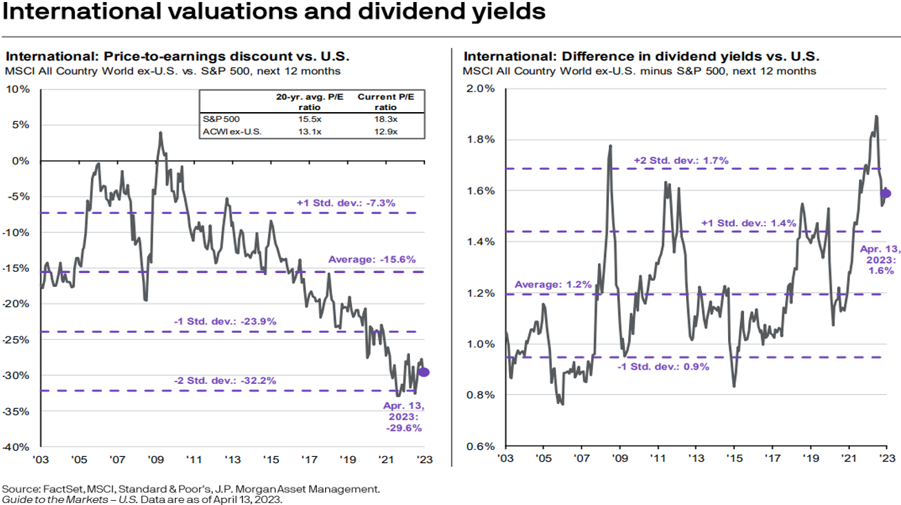
Dividend Yields for International and US Stocks
International stocks are also maintaining their discount to US stocks as well as their higher average dividend yield suggesting further evidence that international stocks may be cheaper than US stocks.
Interest Rates, Commodities, and Inflation
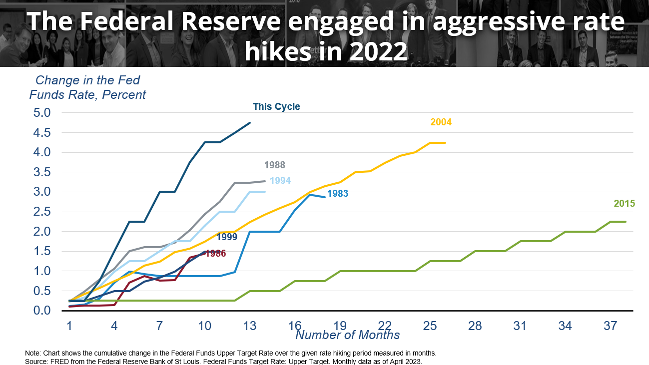
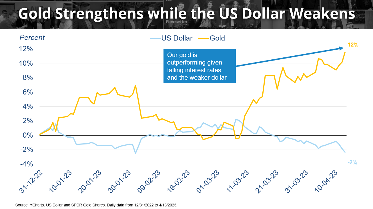
Starting with the Fed rate hiking cycle, we’ve mentioned that this rate hike cycle is one of the most aggressive ever (first chart below). Seen in the next chart we compare the dollar (blue line) with the price of gold (gold line). The strength of the dollar is normally highly correlated to interest rates meaning that when interest rates increase, the dollar strengthens, and when interest rates decrease, the dollar weakens. Now that the Fed is expected to keep rates steady and could even lower rates this year (which can weaken the dollar), gold has begun to perform well. Notice the inverse relationship between the strength of the dollar (blue line) and gold (gold line), in the second chart below. Incorporating gold in client portfolios has added additional layers of diversification as the Fed now pumps the breaks on hiking rates. While interest rates haven’t started to decline yet, markets are already anticipating this which could be why gold has seen strong returns already for 2023.
Fed Funds Rate Expectations
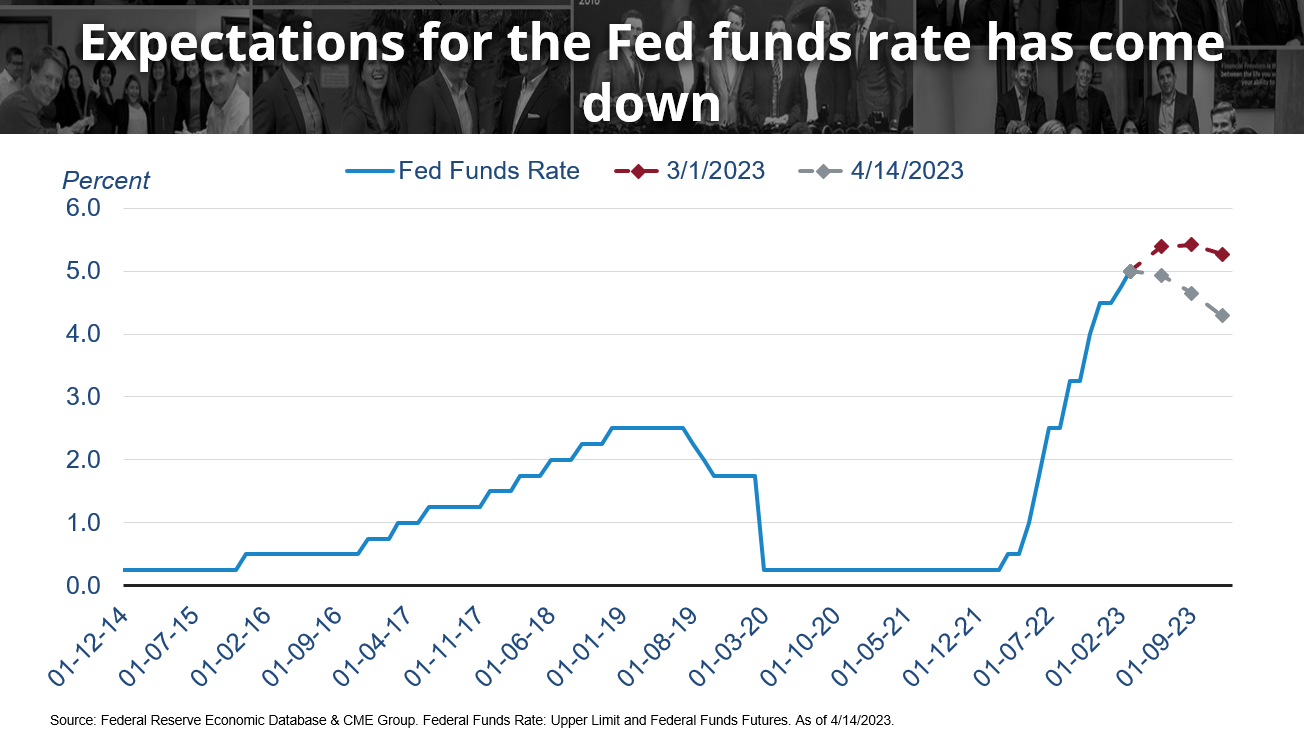
Fed expectations are changing rapidly which could offer clues as to why markets have already seen some positive returns so far in 2023. Just last month, expectations that the federal reserve will continue quantitative tightening and increasing rates have lowered dramatically, largely due to the recent banking crisis of Silicon Valley Bank explained in our recent financial article here. The red dots indicate what interest rates were projected to be before the banking crisis, whereas the gray dots indicate where rates are projected to be now (4/14/2023). This indicates that the Fed tightening cycle may end sooner than expected, which could be good for bonds. Remember, that when interest rates rise bond prices decrease and when interest rates fall, bond prices increase. Now that interest rates are not expected to increase as much as previously anticipated, investors are becoming more interested in bonds; more on bonds later.
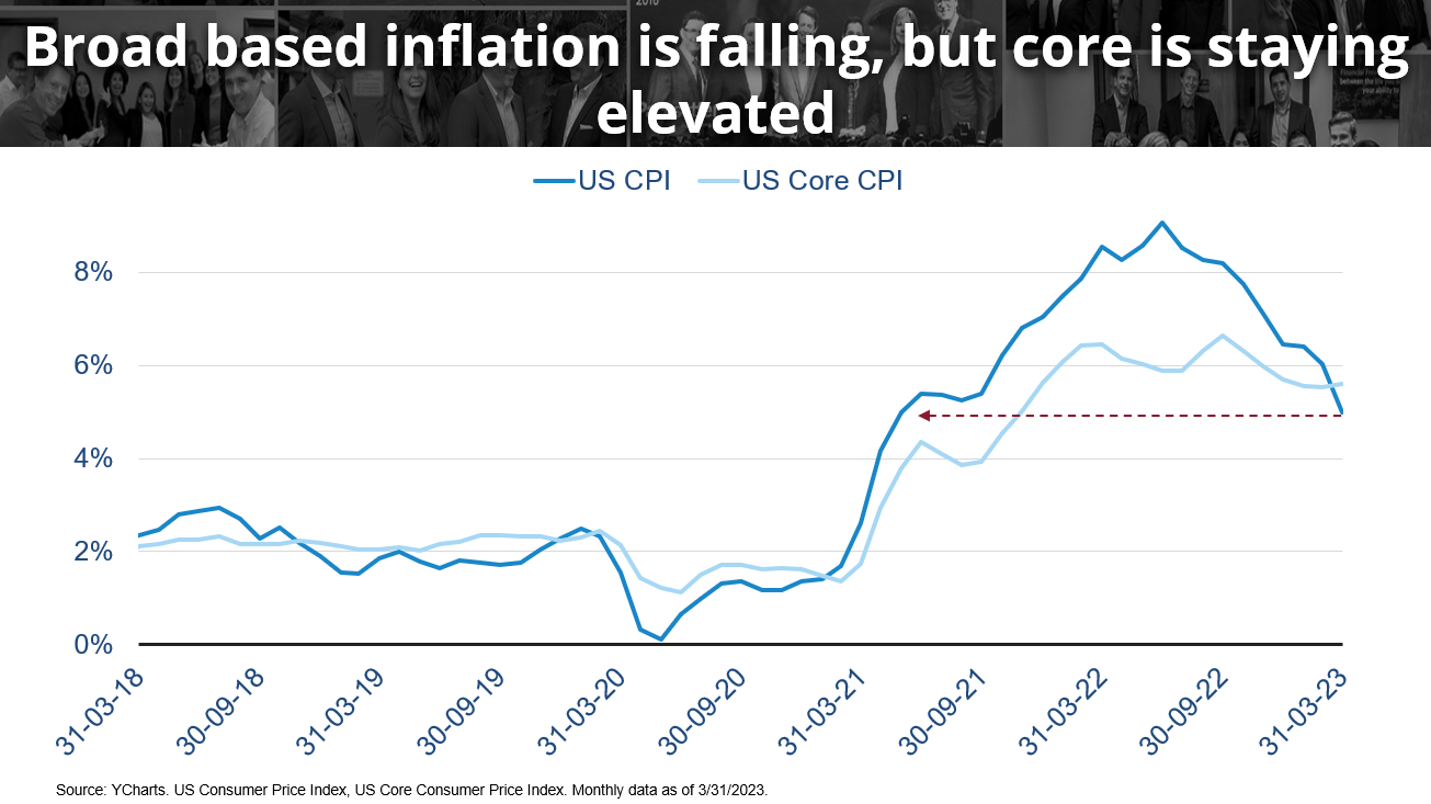
Broad-Based Inflation vs. Core Inflation
Inflation, measured by the Consumer Price Index and the Federal Reserve’s main concern in planning quantitative tightening schedules, has decreased to a near two-year low, yet remains elevated above 4%; Fed long-term targets 2%. US Core CPI measures consumer prices excluding food and energy because they tend to have higher price volatility. As depicted by the light blue line in the first chart below, core CPI remains sticky compared to CPI (dark blue line).
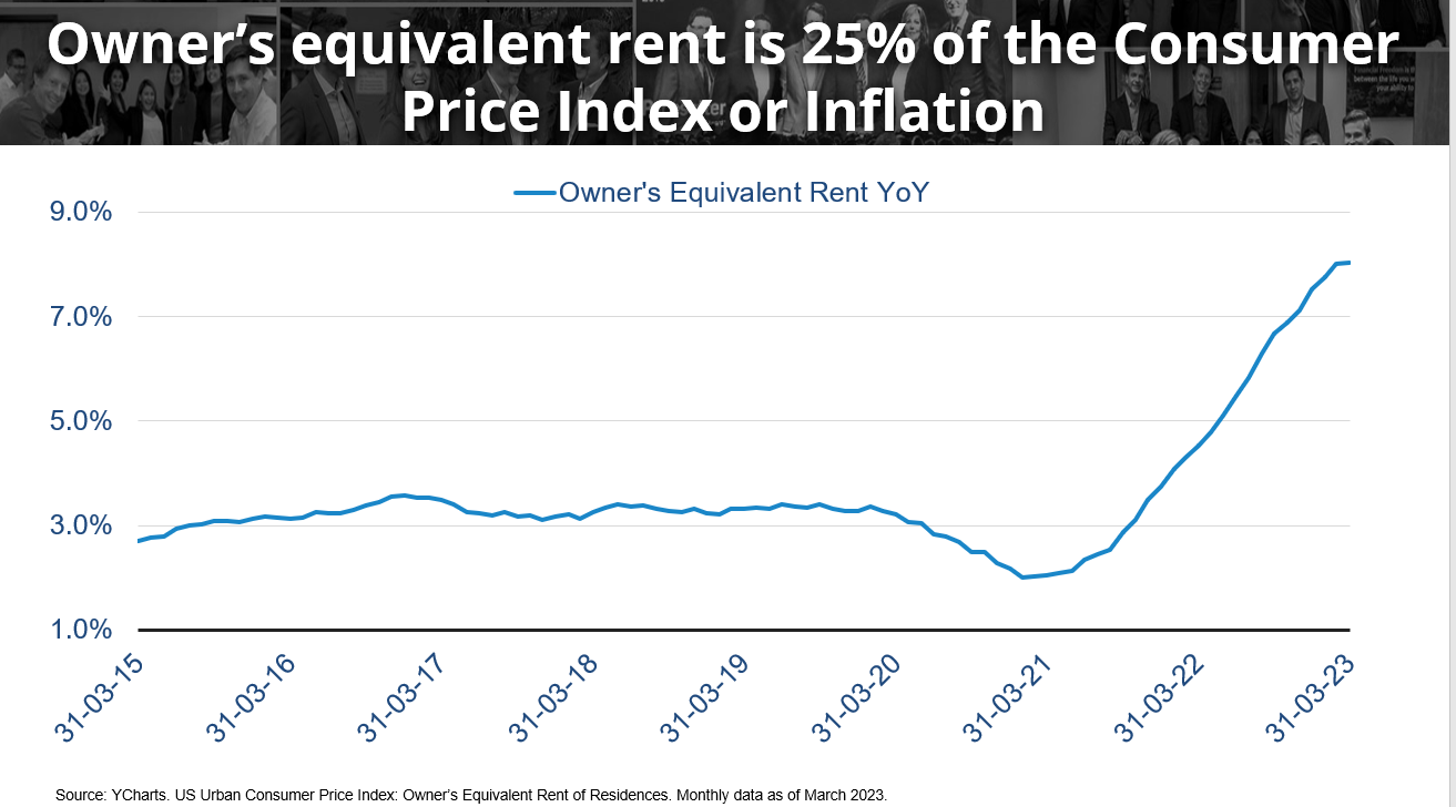
Rent Increases
The housing element plays a large role in core CPI calculation and when analyzing owners’ equivalent rent, we can see that costs have not seen relief. Over the last 10 years, typical rent increases have consistently been around 3%, whereas in the last 3 years price rises have increased to nearly 8% (chart below).
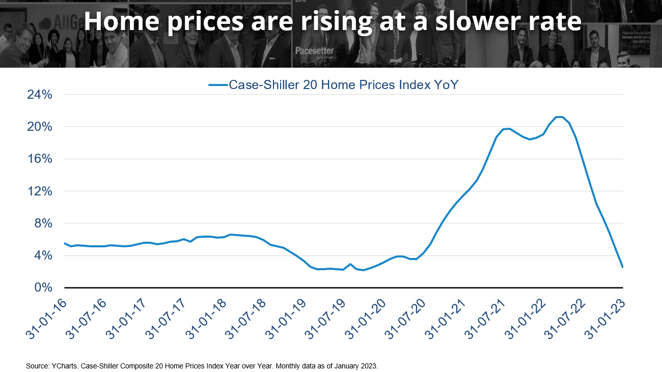
Rising Housing Prices
The following chart tracks the Case-Shiller 20 home price index which appears to have normalized. In mid-2022, home prices were increasing by 20% year over year. In early 2023, home prices are still increasing, but at even lower rates than we’ve seen before 2019; this should help reduce inflation.
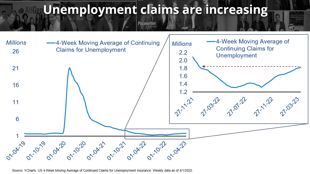
Increasing Unemployment Claims
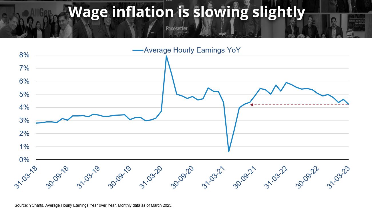
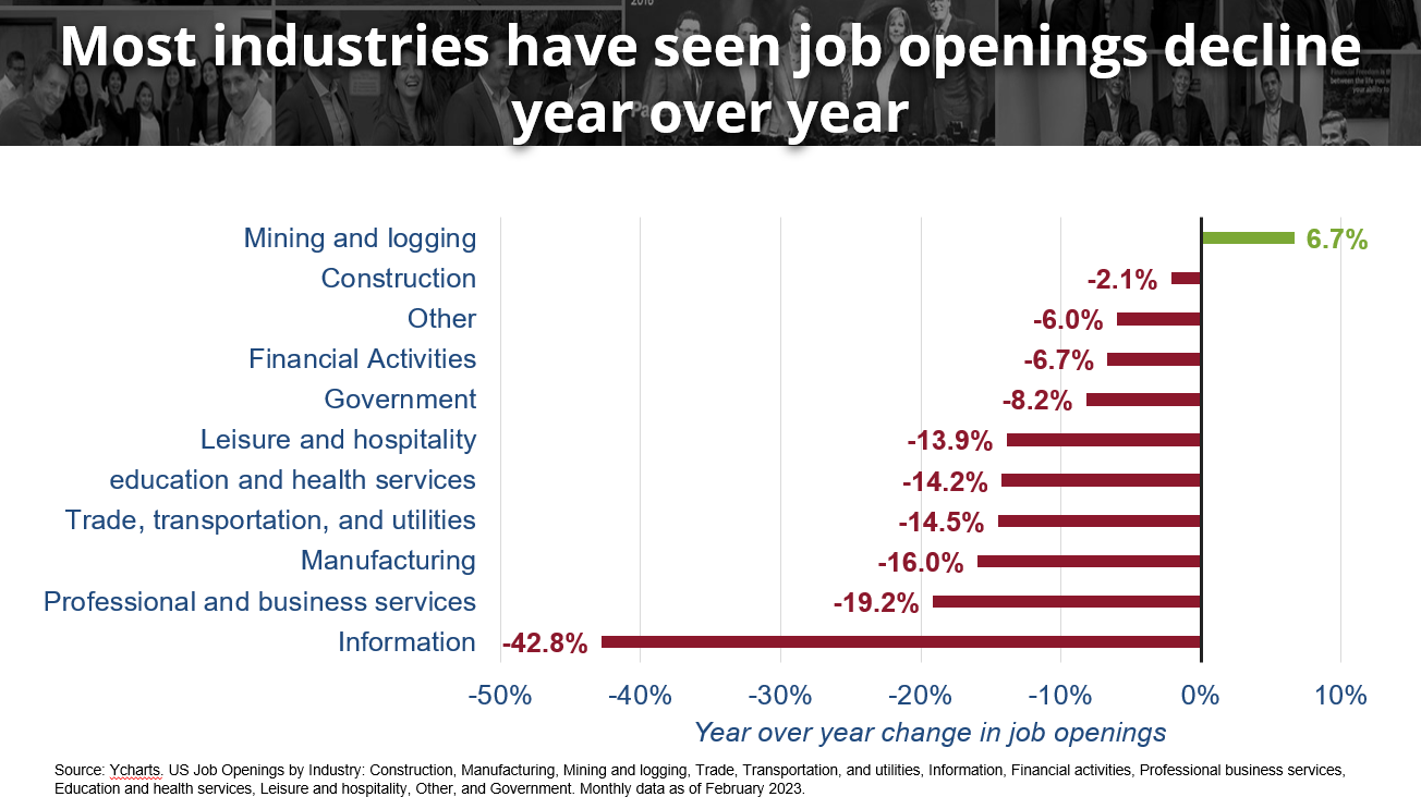
Although it seems like we are in a recession, it really hasn’t felt like it from the standpoint that unemployment has been so low in combination with strong wage inflation since late 2021. Strong wage growth and low unemployment both contribute to higher inflation, which has shown signs of reversing (as in the first two charts). Job openings have also been declining gradually through 2022 and 2023 which can reduce the need for companies to pay higher wages to attract talent which can further reduce inflation. Most industries have seen large declines in job openings with information technology losing the most (third chart). Jason Martin further explains these charting relationships in the video at the bottom of the page.
Bond Prices and Yields
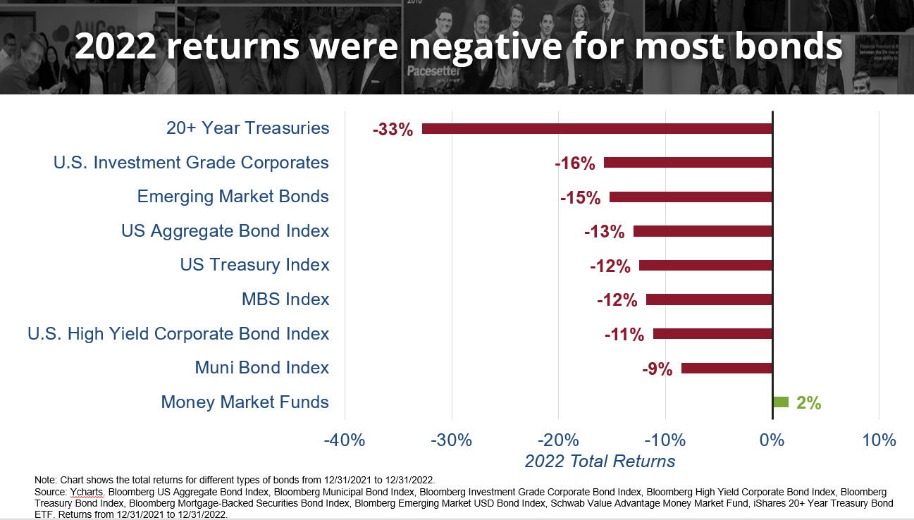
Finally, bonds are beginning to show their value as yields come down. Remember that bond prices move inversely to yields meaning that when yields decrease, bond prices increase. Earlier we described 2022 as one of the most aggressive Fed rate hike cycles and as rates rose, bond prices saw their worst decline on record. Longer term bonds are typically more sensitive to changes in interest rates, evident in the chart below where 20+ year Treasuries declined the most of -33%. In early 2022, AllGen began underweighting bonds and incorporating money markets funds into client portfolios.
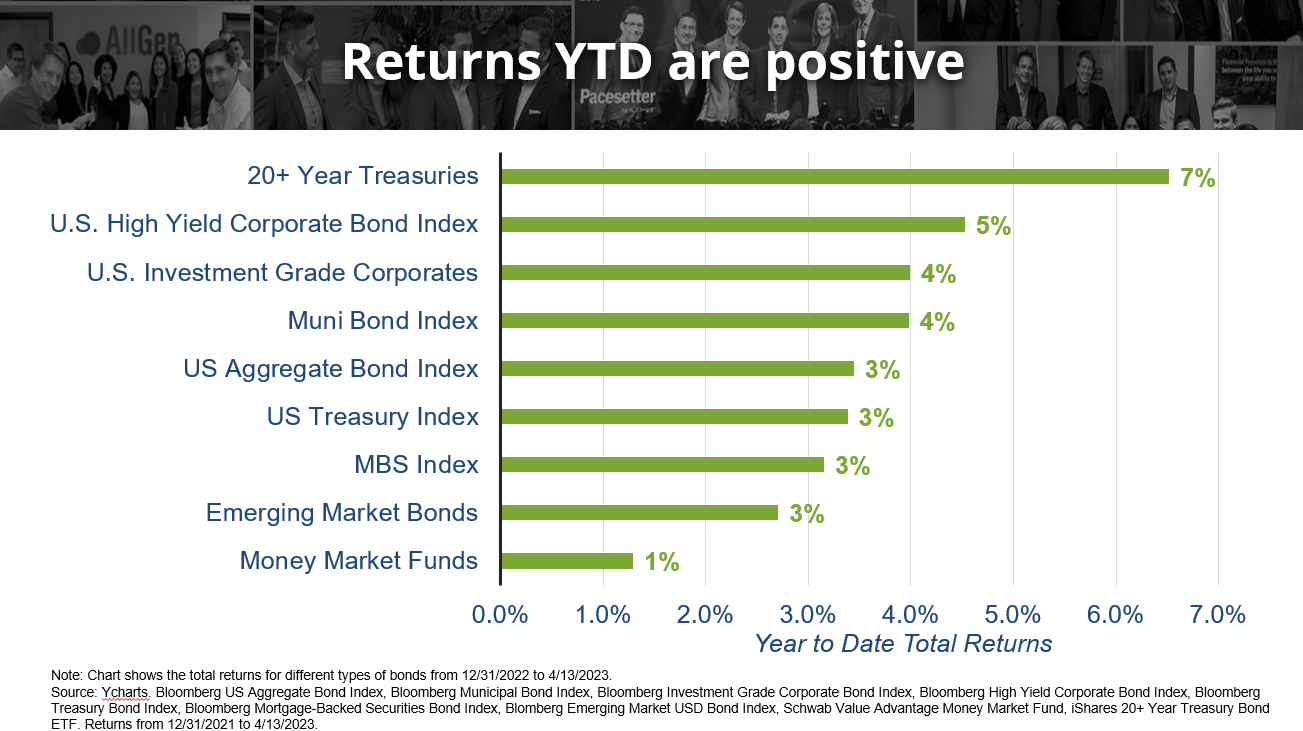
Now that the Fed has reduced expectations of continuing an aggressive hiking cycle, markets have become optimistic about bonds. In fact, just in 2023 as of 4/13 all bond categories from the same chart above are now appreciating nicely. We have already added to our bond weighting in anticipation of this trend change. Notice how in 2022, 20+ year Treasuries were down -33% whereas just in the first 3 and a half months of 2023, they are up 7%!
Referring to the emotional rollercoaster discussed at the beginning of this article, investors should always be mindful of their emotions, especially during scary downturns. Selling out of a declining market usually means missing out on potential rebounds on the other side. Remaining calm and diversified can help investors weather the storm instead of abandoning ship too early.
Diversification and Portfolio Returns
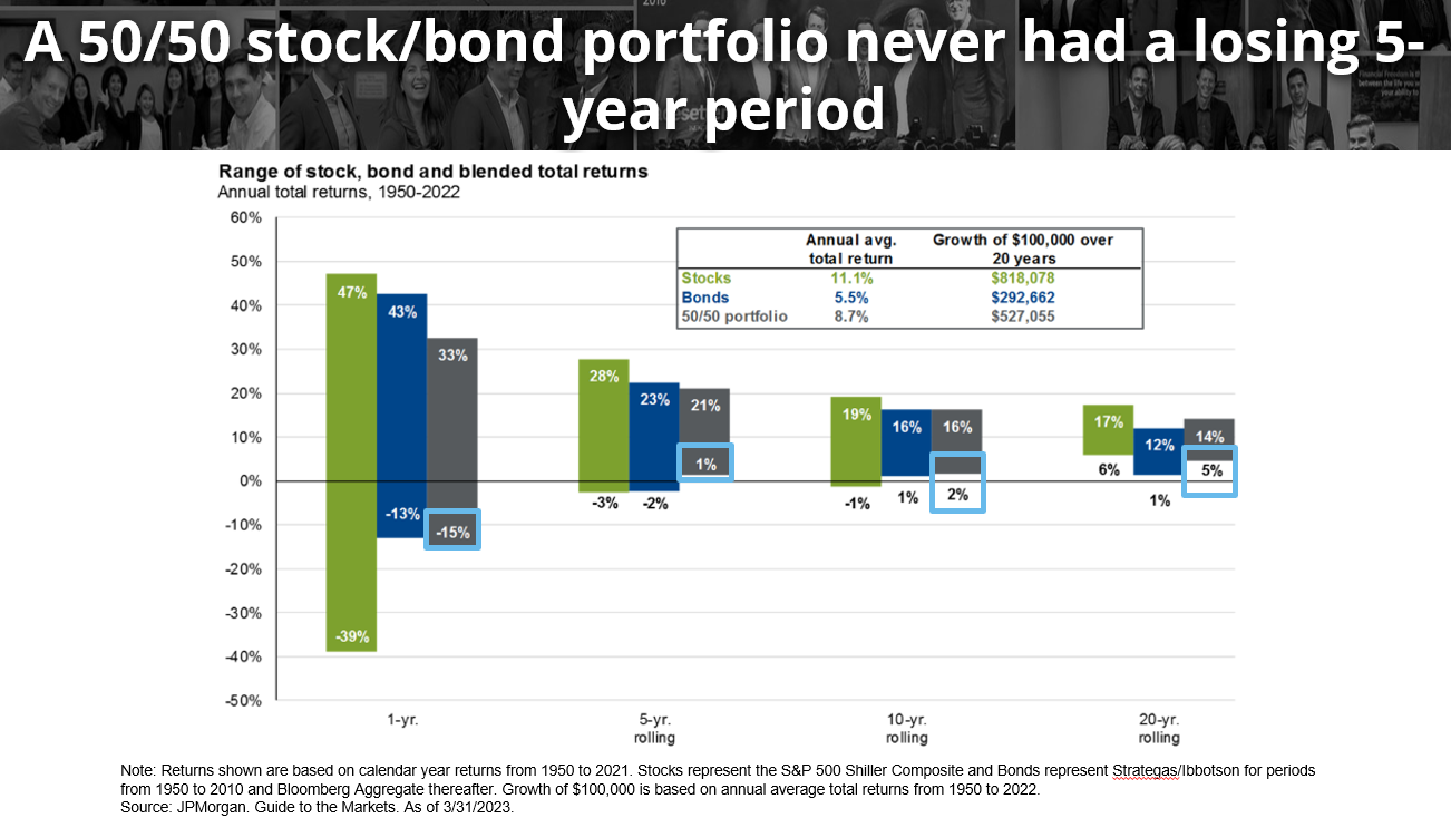
Our last chart focuses on diversification and illustrates a powerful reason to remain diversified. A 50/50 stock/bond portfolio hypothetically invested since the 1950s has seen its share of ups-and-downs however, most returns exist above the 0% line. By focusing on the gray bars, which indicate the stock/bond portfolio combined, we see that the maximum drawdown in a 1-year period was -15%. Sliding to the right, notice how the worst 5-year period of the same portfolio had a positive 1% annual return. As the rolling period increases, the worst rolling drawdowns improve! This illustrates the need for discipline when investing because if investors sell out of fear, it will likely be long after the recovery before they decide to get back into investing. Remaining invested and diversified can be critical in your path to achieving financial freedom.
For more information on how AllGen can help with your investment strategy through your journey to financial freedom, contact your advisor here!
For more information, watch the full April 2023 Market Update video below.
Important Disclosures: The information provided here is of a general nature and is not intended to answer any individual’s financial questions. Do not rely on information presented herein to address your individual financial concerns. Your receipt of information from this material does not create a client relationship and the financial privileges inherent therein. If you have a financial question, you should consult an experienced financial advisor. Moreover, the hiring of a financial advisor is an important decision that should not be based solely upon blogs, articles, or advertisements. Before you hire a financial advisor, you should request information about the financial advisor’s qualifications and experiences. Past performance is no guarantee of future results. All expressions of opinion are subject to change without notice in reaction to shifting market conditions. Data contained herein from third party providers is obtained from what are considered reliable sources. However, its accuracy, completeness or reliability cannot be guaranteed. Examples provided are for illustrative (or “informational”) purposes only and not intended to be reflective of results you can expect to achieve. AllGen Financial Advisors, Inc. (AllGen) is an investment advisor registered with the SEC. AllGen does not provide personal financial advice via this material. The purpose of this material is limited to the dissemination of general information regarding the services offered by AllGen. The Disclosure Brochure, Form ADV Part II, which details business practices, services offered, and related fees of AllGen, is available upon request.


