Read through the blog here, or skip to Jason’s January 2024 Market Update video below.
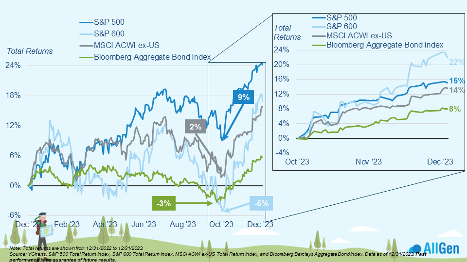
Markets generally left 2023 better than they found it with the S&P 500 gaining 24% along with 17% and 16% for small-cap and international stocks respectively, followed by bonds gaining 6%. Although 2023 saw above-average market growth, the year began in turmoil as investors witnessed the March 2023 regional banking crisis that led to the failure of five banks in the first half of the year according to the FDIC. Prior to the crisis, investors were already bracing for something to break as the Federal Reserve was still aggressively raising interest rates. Markets became volatile then, but the situation was swiftly resolved, letting markets resume.
Market Uncertainty in 2023
Markets saw additional uncertainty in the latter half of 2023 as the Fed began signaling “higher for longer” interest rate targets. After exiting the seasonally weak months of August and September, nearly all indexes were well above their October 2023 lows.
All the major indices rebounded strongly in Q4 2023.
The Impact of Investor Sentiment
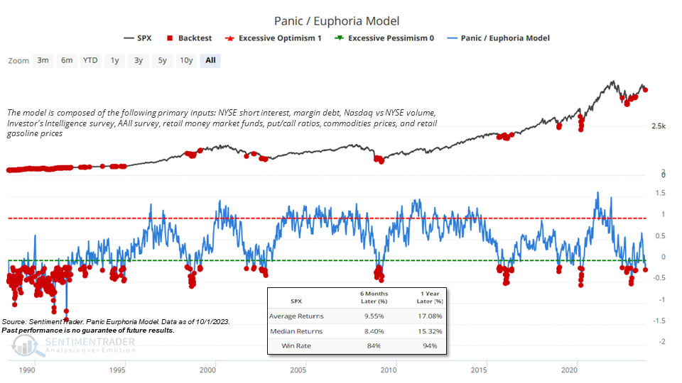
Circling back to sentiment referenced in our October Quarterly Webinar, we can remember the Panic/Euphoria model, which measures a myriad of market indicators like NYSE short interest, margin debt, and trading volume just to name a few. When the indicator reaches extreme pessimism, as it did in October of 2023, returns in the S&P 500 over the next 12 months were positive 94% of the time and averaged 17.08% growth. Markets were above their October lows when the indicator gave the signal of extreme pessimism. Although it might seem scary to invest when most individuals are panicked, historically, investing at these times has tended to be a great opportunity.
Panic is typically highest at the bottom.
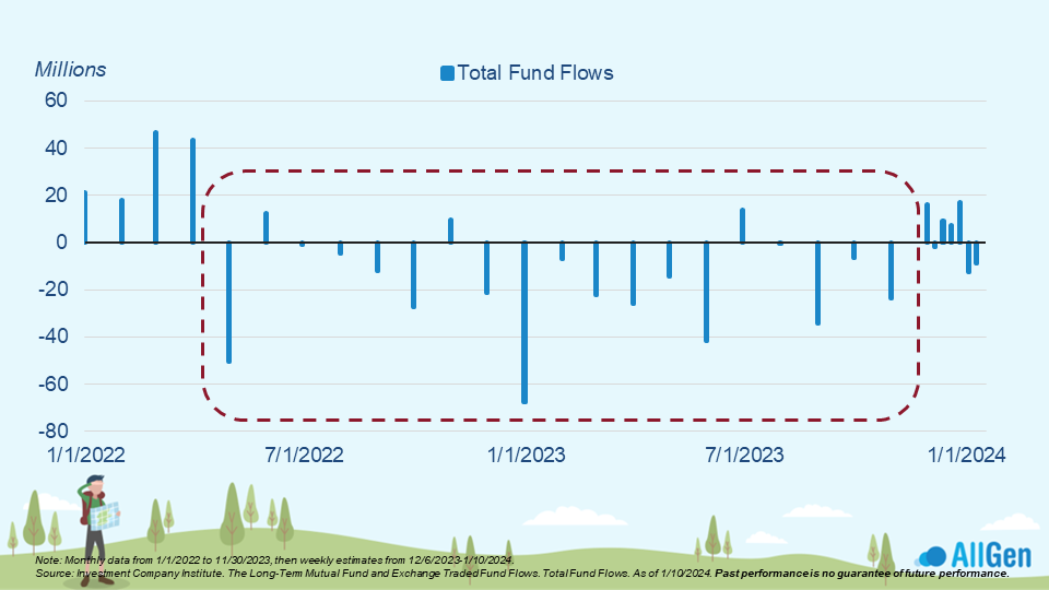
Fund Flows in 2022
Rewinding back to 2022, investors spent most of the year taking money out of the market. The chart below shows fund flows into and out of the market; a bar aiming above the midline means funds were entering markets (buyers) whereas a bar aiming down from the midline means that funds were leaving markets (sellers).
Investors typically pull out of the market when the prices decline.
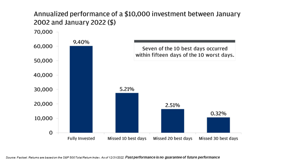
The Best Times To Invest
Most investors that sell out of fear typically end up missing out on most of the market recovery because they don’t usually buy back until long after the recovery has begun. Historically, the best days in markets occur shortly after the worst days in markets. If you were to invest $10,000 in 2002 but missed 30 of the best days, you would have about $10,700 as opposed to the almost $60,000 someone who remained invested the whole time would have. Selling your investments at the wrong time can be catastrophic for long-term growth.
The importance of staying invested.
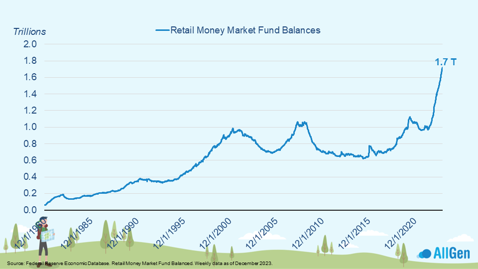
Cash Pushes Markets Higher
Below we examine retail money market fund balances that represent the amount of cash in retail brokerage accounts sitting on the sidelines. It also can represent investors who have sold out of their investments and replaced them with money market funds. Notice how recently there has been a spike in which money market balances went from $1 trillion to $1.7 trillion in nearly a 1-year period. As markets start to look better, extra cash on the sideline can be “fuel to the fire” where potential buyers push markets higher.
Retail money market fund balances are elevated.
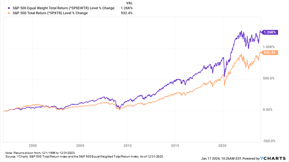
The Importance of Diversified Investments
Most people know that the S&P 500 is a basket of large U.S. companies, but many forget how these 500 companies are weighted within the index. The S&P 500 incorporates the top 500 U.S. companies, weighted by market cap. For example, Apple and Microsoft are among the largest companies by market cap in the world, meaning that they carry the highest weightings in the index. When comparing the performance of the market cap-weighted S&P 500 with an equal-weighted S&P 500 index, we can see that the market cap-weighted index (what most know as the S&P 500) has outperformed recently; however over the long run, the equal-weighted S&P 500 has also outperformed. What this means is that while sometimes the largest, most popular stocks can lead for periods of time (like the late 90s and over the last 5 years), historically, over the long term, it is better to be well-diversified rather than having a high concentration in just a few stocks.
S&P 500 cap weighted was pulled higher by a handful of tech stocks in 2023.
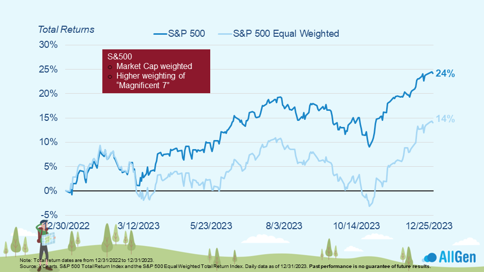
The Equal Weighted Index has outperformed the Cap Weighted Index over the long run.
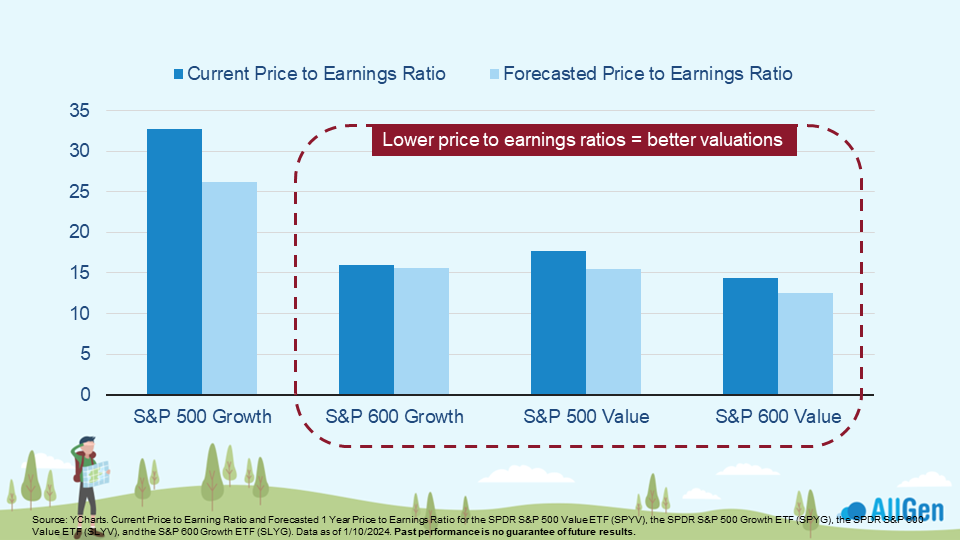
Small Cap Stock and Value Stock Valuations
One valuation metric that’s largely talked about in financial media is the price-to-earnings ratio, which takes the price of a stock and divides it by the earnings per share outstanding. A stock that has a low price-to-earnings ratio would mean that the stock is priced cheaply relative to earnings. Looking across stocks of all sizes we see that smaller companies, those not in the S&P 500, currently have better valuations. We’ve been adding to our small and medium-sized company position.
Valuations for small-cap stocks and value stocks are more attractive going into 2024.
Furthermore, we can divide the price-to-earnings ratio by the forecasted earnings growth to calculate a PEG ratio. We can see that the S&P 600 growth, which represents small-cap growth companies, stands out among other asset classes as having a better PEG ratio. A Lower PEG ratio implies better valuations.
Forecasted earnings growth for S&P 600 growth stocks is higher than for S&P 500 growth stocks.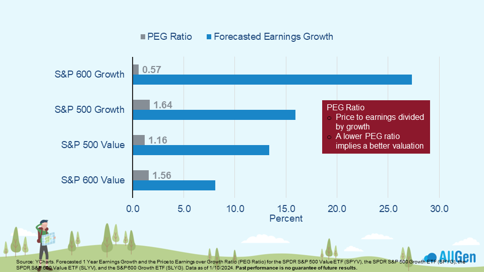
Investing in International Stocks
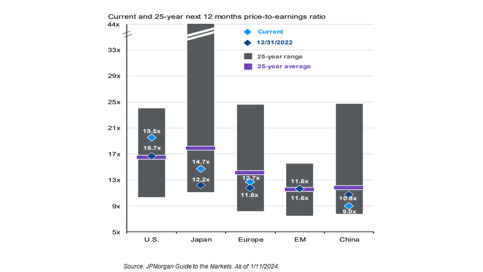
In the spirit of applying price-to-earnings ratios to large, medium, and small-cap stocks, we can also apply it to U.S. and international stocks. While the chart below may look complex, by focusing on the light blue diamonds, we can quickly see that regions below the purple line are currently better valued. Nearly all regions have been better valued than the U.S. over the last 25 years. This typically comes before good performance, which is something we are closely monitoring.
Global valuations
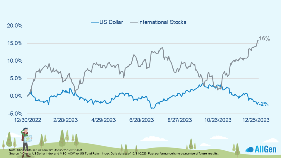
The trend of the dollar is also an important factor when determining the performance of international markets. See below how the prices of international stocks (the gray line) tend to move inversely to the trend of the dollar (the blue line). Simply put, a weaker dollar is supportive of international stock prices.
International rebounded into year-end as the dollar declined.
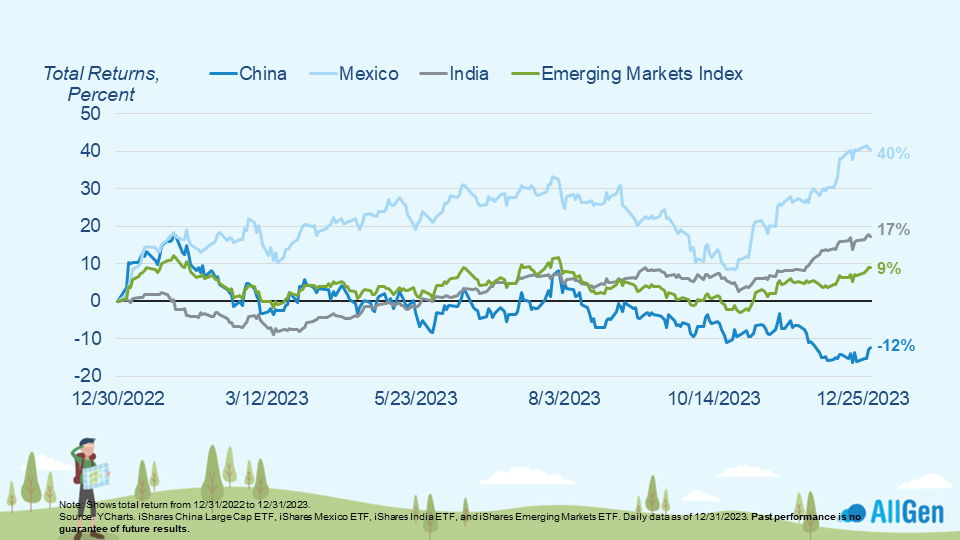
Diverging Performance of Emerging Markets
Emerging markets represent developing countries and have seen some wide divergences in performance. China has been under pressure throughout 2023 as it relates to international trade and geopolitical relationships which has caused many other emerging markets to pick up the slack. Reshoring and nearshoring have been a general post-pandemic theme as companies bring operations back to the U.S. or nearby neighbors such as Mexico and South America. Below we illustrate this divergence by pointing out Mexico’s dominance among emerging market countries, up 40% for 2023 whereas China is down -12%.
Mexico and India outperformed the overall market while China underperformed.
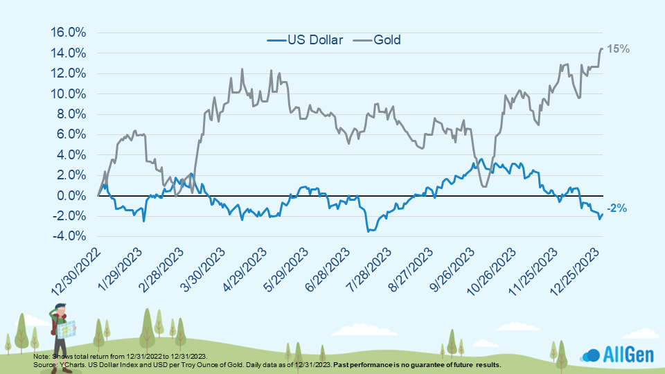
Gold and Portfolio Diversification
Another position that can help diversify a portfolio and tend to perform well when the dollar is weaker is gold. Seen below, we plot the trend of the dollar (the dark blue line) to compare it with the price of gold, which finished 2023 up 15% while the dollar declined 2%. We continue to hold gold to further diversify portfolios.
Gold finished the year strong as the dollar and rates fell.
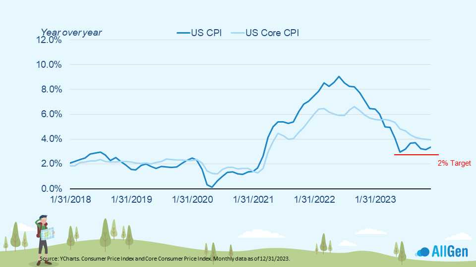
Elevated Inflation
Tracking inflation from 2018, we can clearly see where the Covid-19 pandemic came and went with a spike in inflation in 2021 and a gradual decline through 2023. Although the U.S. consumer price index (CPI), a measure of inflation, has come down significantly from its highs of nearly 9%, it remains above the Federal Reserve’s 2% target. If Inflation hovers above the target for longer than expected, it could prevent the Fed from lowering interest rates in the near term. Higher rates for longer could put more pressure on the economy, which is something we’re closely monitoring.
Inflation may prove more difficult to lower from here than the markets are expecting.
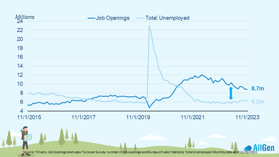
A contributing factor to inflation is “wage inflation,” meaning that when people get paid more, they tend to spend more. A tight labor market can pressure employers to offer higher pay to attract and retain workers; currently, there are more jobs available than people to fill these jobs. As seen in the chart below, there are currently only 6.2 million people who are unemployed, but 8.7 million openings.
There’s a shortage of 2.5 million workers relative to job openings.
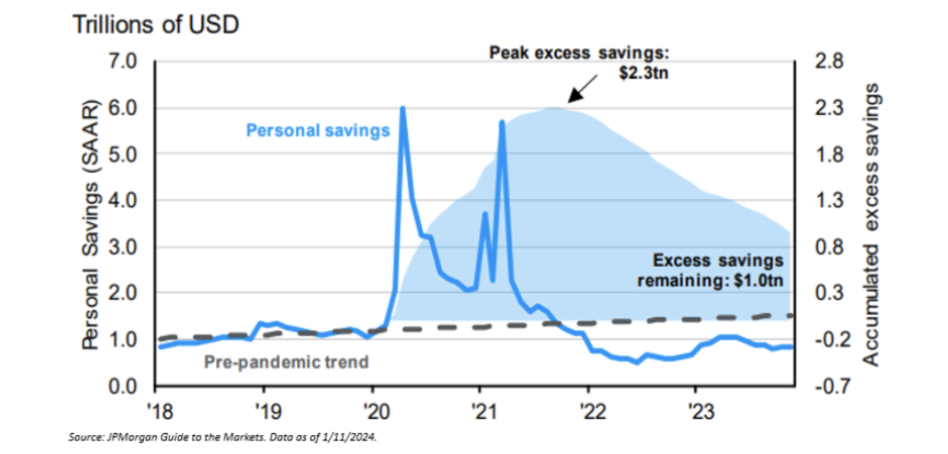
Consumers and Economic Growth
Consumers are one of the main drivers of economic growth, so it’s important to check up on them consistently. The chart below shows the personal savings and how it spiked in early 2020 as the pandemic was unfolding. Markets were falling, which caused many people to reallocate their income and portfolios to savings, especially later in 2020 and early 2021 as government stimulus checks were hitting the accounts of millions of Americans. Fast forward to today, the personal savings rate is negative; however, consumers still appear to have excess savings to draw from (shown by the light blue shaded area). We’re closely monitoring the financial health of the consumer as they draw down their excess savings, which could provide near-term support for the economy but which will eventually run its course. Once this happens, the consumer may be less willing to spend and/or may have to take on debt to finance spending.
Consumers still have excess savings to spend down.
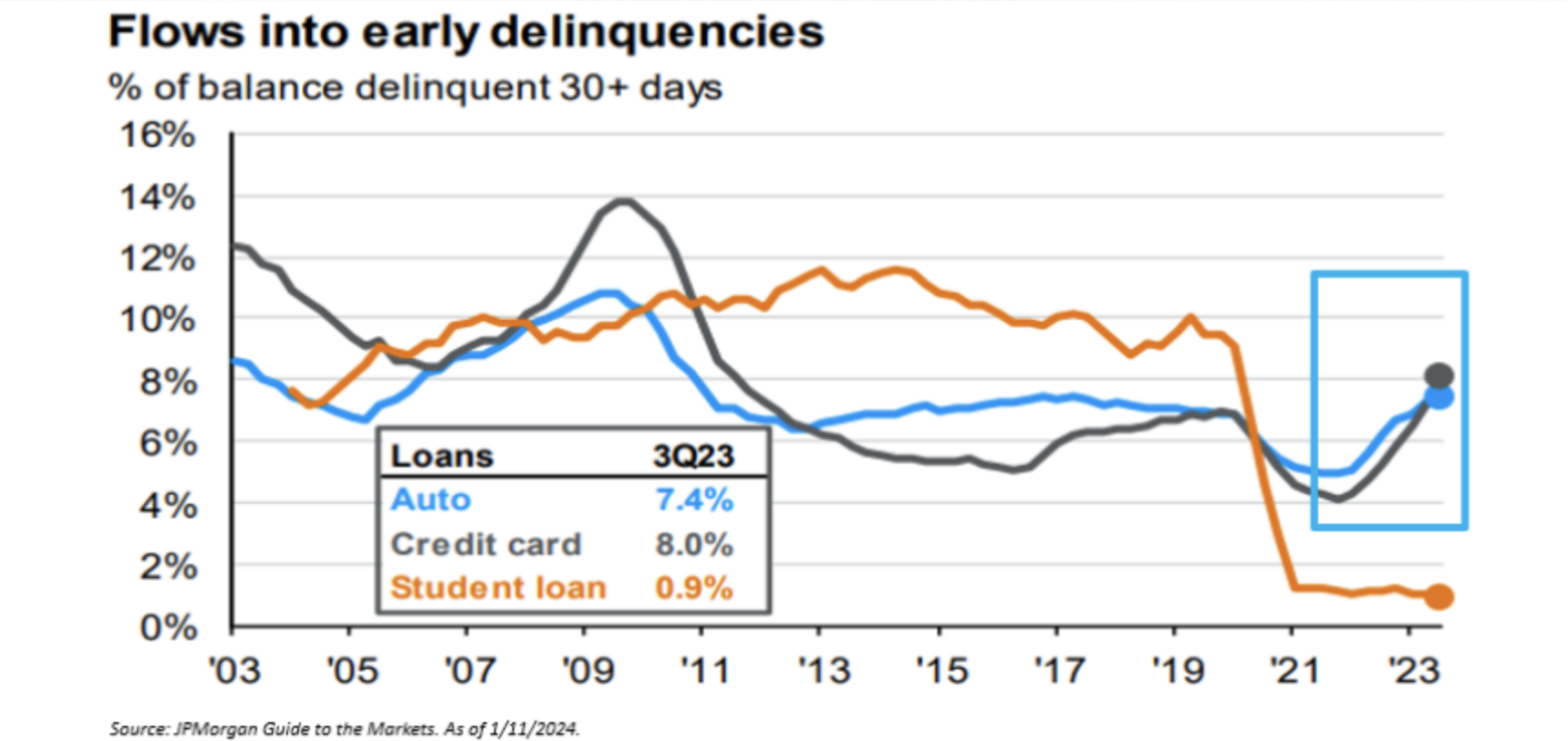
We can already see that more consumers are beginning to feel some pain by analyzing the number of auto loans and credit card loans that are delinquent for more than 30 days. The chart below indicates some early warning signs that the health of the consumer might be weakening as delinquencies rise.
Yet, cracks are starting to show in consumer financial health.
Inflation, Interest Rates, and Bonds
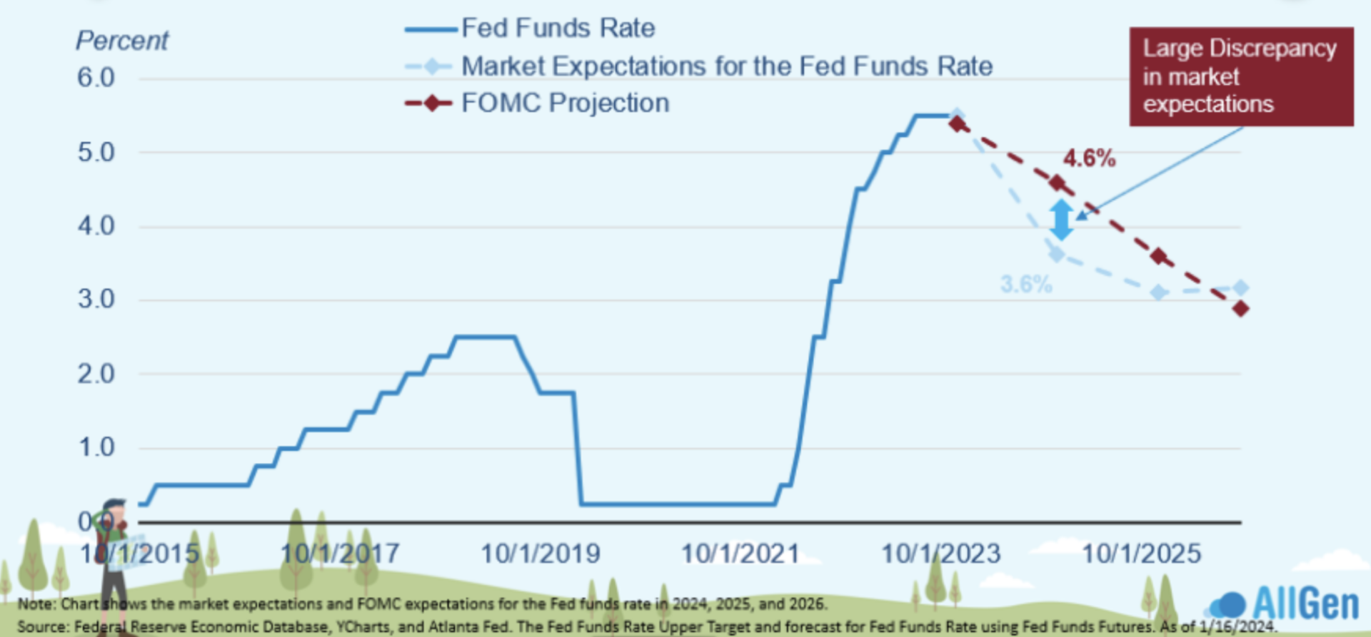
We continue to mention the Federal Reserve and its motives behind raising interest rates. To recap, because inflation got out of control during the COVID-19 pandemic and for much of the last two years, the Federal Reserve was aggressively raising interest rates to combat inflation. Remember that markets anticipate the future and that although the Fed might signal higher rates for longer, markets have anticipated that the Fed will need to step in sooner rather than later. Lower interest rates typically stimulate the economy and vice versa. We can compare the FOMC (Federal Reserve) projection (the red dotted line), vs. the market’s expectations (the blue dotted line) and can visually see that market expectations are lower than FOMC projections. This gap in expectations will have to close eventually and it is likely that the two will meet somewhere in the middle by the end of 2024.
Expect volatility in the bond market as the expectations of the Fed and the market converge.
Reversals in the Bond Market
Since interest rates are projected to come down, what does that mean for bonds? We can already see a reversal occurring in the bond market. Bond prices have rebounded as yields declined, anticipating rate cuts in 2024. Keep in mind that bond prices move inversely to bond yields.
Keep in mind that prices and yields move inversely for bonds.
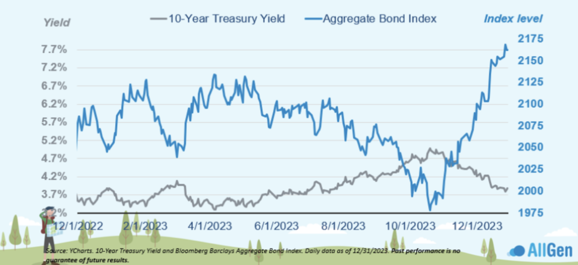
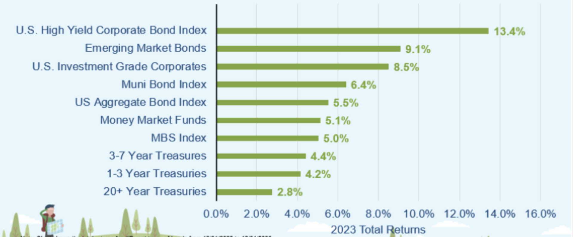
2021 – 2022 has been one of the worst-performing bond markets on record. We’ve mentioned in several recent market updates that bond markets typically flourish after periods of negative returns. In 2023, bonds finally turned a corner and finished the year positive in nearly all bond types. We spent much of 2023 adding to our fixed-income position.
Fixed income ended the year on a positive note.
Rising National Debt Levels
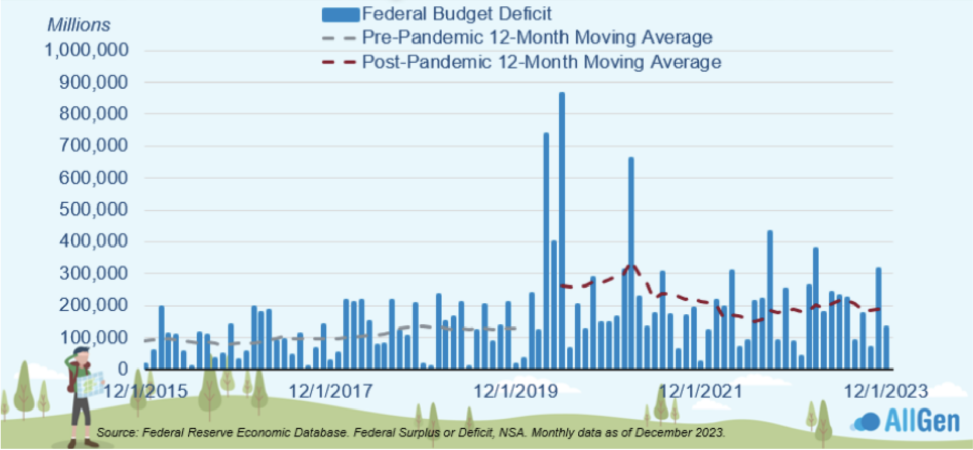
One long-term issue we see for the U.S. is rising national deficit levels. The deficit is defined by the difference between funds received vs. funds spent. A deficit would mean that the government is spending more than it is receiving. Early 2020 saw massive spikes in deficits as the government passed unprecedented spending packages to support the economy during the COVID-19 shutdown. On an annual basis, pre-pandemic average deficit levels were around $1 trillion, whereas post-pandemic deficit levels jumped to $2 trillion per year.
The budget deficit has trended higher since the pandemic.
How Politics Affects Investing
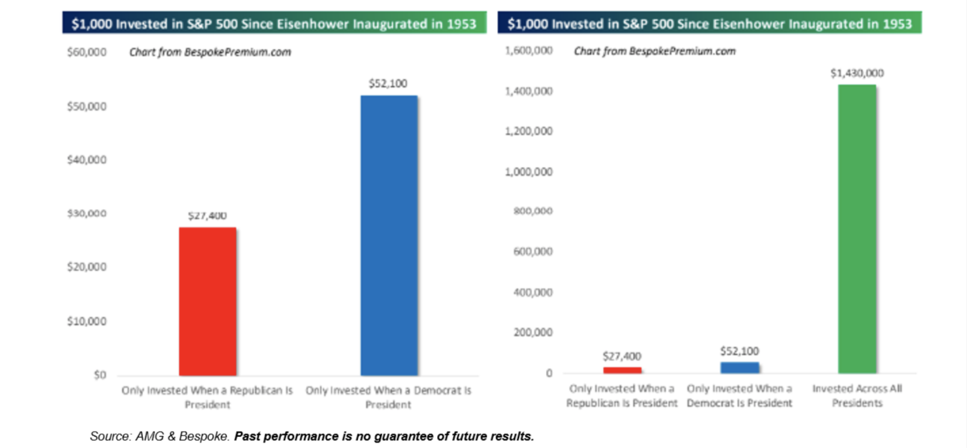
2024 will no doubt be filled with political noise where many investors will fearfully make irrational changes to their investments. Given that it will be an election year, we want to warn clients that news media around the country will try to target your emotional connection with your money. Below, we illustrate the power of staying invested and what $10,000 invested in the S&P 500 index in 1953 would be today. If we only invested when a Republican was president, it would be $27,400 today, whereas investing only when a Democrat was president results in $52,100. However, if we kept $10,000 invested the entire time – regardless of who the President was – it would be $1,430,000. While many can agree that politics should stay away from the dinner table, we also feel the same regarding investment decisions.
Don’t let politics keep you from investing.
Contact Your Financial Advisor
AllGen Investment Management continues to monitor economic data and adjust strategies on an ongoing basis, so you don’t have to. Since markets are constantly changing, it’s important to have someone stay current on these topics to help you achieve your financial goals as quickly as possible. Click here to learn more about how AllGen can manage your investments!
For more information, watch the full January 2024 Market Update video below.
Important Disclosures: The information provided here is of a general nature and is not intended to answer any individual’s financial questions. Do not rely on information presented herein to address your individual financial concerns. Your receipt of information from this material does not create a client relationship and the financial privileges inherent therein. If you have a financial question, you should consult an experienced financial advisor. Moreover, the hiring of a financial advisor is an important decision that should not be based solely upon blogs, articles, or advertisements. Before you hire a financial advisor, you should request information about the financial advisor’s qualifications and experiences. Past performance is no guarantee of future results. All expressions of opinion are subject to change without notice in reaction to shifting market conditions. Data contained herein from third party providers is obtained from what are considered reliable sources. However, its accuracy, completeness or reliability cannot be guaranteed. Examples provided are for illustrative (or “informational”) purposes only and not intended to be reflective of results you can expect to achieve. AllGen Financial Advisors, Inc. (AllGen) is an investment advisor registered with the SEC. AllGen does not provide personal financial advice via this material. The purpose of this material is limited to the dissemination of general information regarding the services offered by AllGen. The Disclosure Brochure, Form ADV Part II, which details business practices, services offered, and related fees of AllGen, is available upon request.


