
Read through our market commentary here, or skip to Jason’s January 2023 Market Update video below.
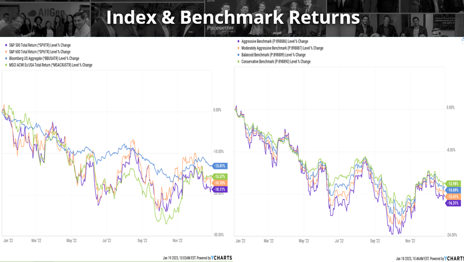
Nearly every broad market category began 2022 at or near all-time highs. Following COVID-19 shutdowns back in 2020, markets saw record stimulus with uncomfortable rises in inflation. Then came record quantitative tightening with desperate intentions to control inflation, all happening in one of the shortest time periods on record! Investors can mostly agree that 2022 has felt more like a hangover year as markets react to complete stimulus cutoffs and reversals since asset prices spent most of 2022 withdrawing from their peaks.
In the charts below we examine 2022 and the performance of US large-cap stocks, US small-cap stocks, international stocks, and bonds, all of which are down over -13%. Partly due to aggressive rate hikes by the Federal Reserve, bonds have seen their worst drawdown on record; bond prices move inversely to rates. Bonds typically hold up better in falling stock markets offering diversification benefits to more conservative investors. However, in 2022, bonds experienced their worst drawdown ever making it difficult for money managers. This caused a notable phenomenon across benchmarks causing narrow differences in returns across aggressive benchmarks (mostly stocks) and conservative benchmarks (mostly bonds).
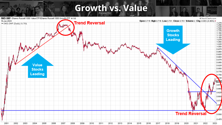
Relationship of Growth vs. Value Stocks
We’ve mentioned the relationship between growth vs. value stocks in past market updates and how they typically outperform one another for several years at a time. Growth stocks typically have weaker balance sheets and are heavily reliant on investor funding of operations. They don’t normally pay dividends (largely tech companies).
On the other hand, value stocks have much stronger balance sheets, an established history of operating profitability, and pay dividends. In the chart below, a rising line means value stocks are leading, while a declining line means growth stocks are leading. Over the last 14 years growth stocks have outperformed significantly, but in 2022 value stocks have outpaced growth which we believe will continue. We have been noticing this trend reversal for several months now and are already favoring value stocks in our client portfolios. Investors should also acknowledge that the Fed has aggressively raised interest rates which increases the cost for companies to borrow money and fund operations. Companies with weaker balance sheets that are more reliant on investor funding like “Growth” companies may incur higher costs to operate and may struggle to outperform in the years ahead. Value companies with low debt and strong operating cash flow may be less affected by rising borrowing costs.
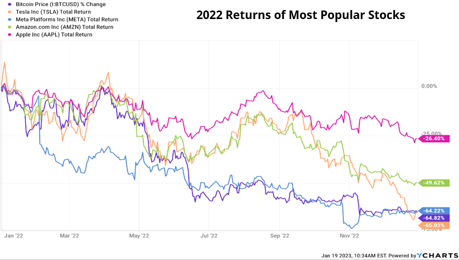
Below are the 2022 returns of common growth companies including Tesla, Meta (formerly Facebook), Amazon, AAPL, and, just for fun, Bitcoin. These companies saw massive gains in 2020 and in 2021 when rates were low, making borrowing costs cheap. In 2022, rates rose faster than expected which increased borrowing costs and put pressure on these companies, all of which declined in price by -50% or more (except for Apple at -26.4%!). Monitoring these shifts in outperformance and adjusting target weights periodically can help investors reduce exposure to risk in a changing market environment.
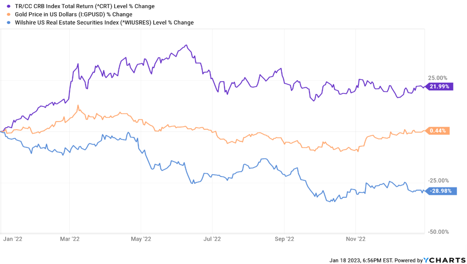
While there were few places for investors to hide in 2022, commodities and gold offered some protection against falling markets which were up 21.99% and 0.44% respectively. Incorporating these asset classes in a diversified portfolio can cushion a portfolio in a falling market. We began 2022 with a strong commodity allocation that helped offset negative returns in other areas of the portfolios.
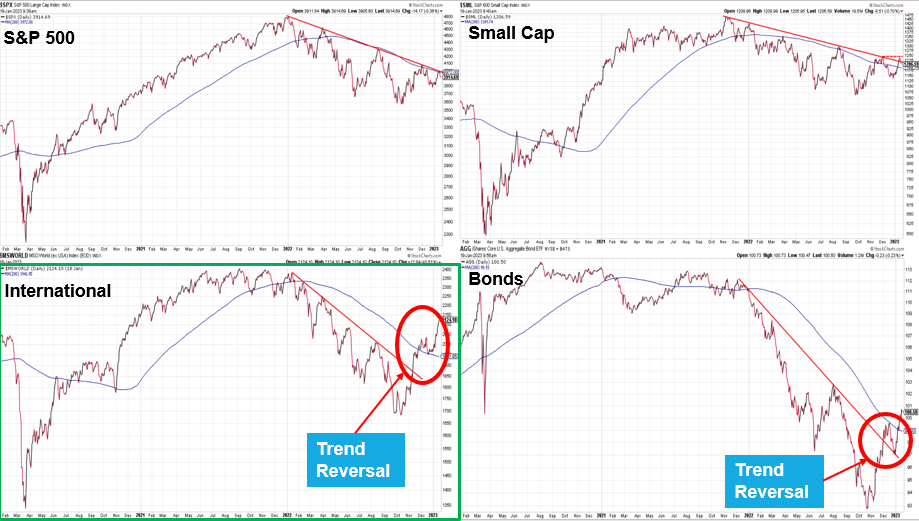
Technical Analysis is a research method we use to help make decisions based on charting and the use of trendlines. In the below illustration, we chart resistance lines (downward sloping red lines) to connect points across all major indexes; US large, US small, international stocks, and bonds. All market indexes have experienced downtrends in 2022. However, international stocks and bonds have signaled recent trend breaks with international stocks exhibiting the largest signal. These are technical indicators that support the idea that international stocks and bonds could continue rising; we will address additional fundamental indicators later on. For additional explanation on technical analysis relating to the below illustrations, see the video at the end of this article.
Fed Attempts to Control Inflation
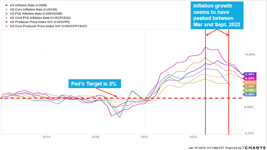
We mentioned earlier that the Fed has been aggressively raising rates in an effort to control rising inflation. There are numerous inflation indicators that can be used to determine the rate at which prices are increasing. See the below chart for several of the most-used indicators, all of which indicate inflation peaked around mid-2022. Although inflation has trended downward, it is still historically elevated and well above the Fed’s 2% target. We believe the Fed is pleased to see inflation trending downward evident in their plans to slow raising rates and hold them steady for 2022.
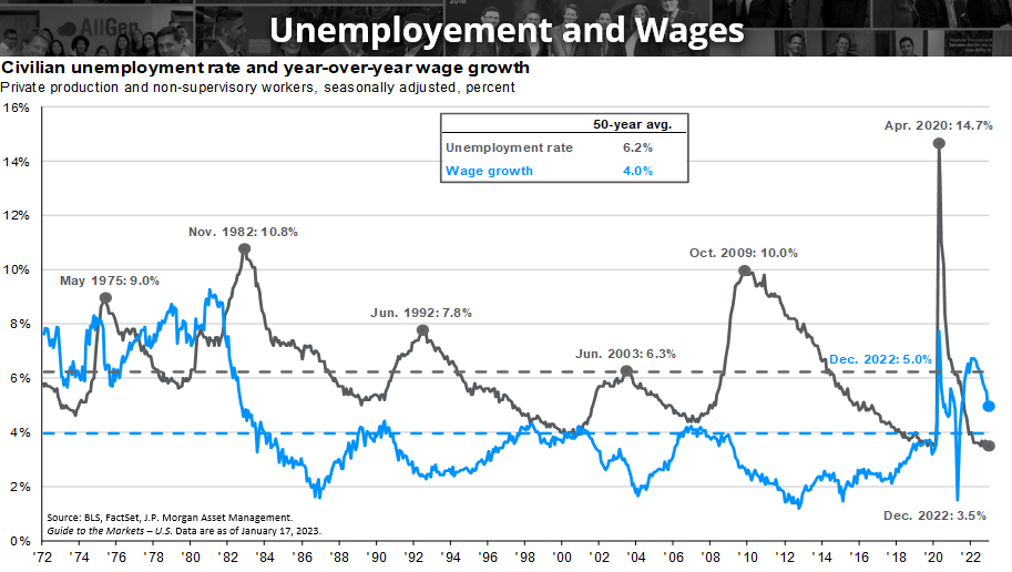
While inflation declines are good news for consumers, one economic factor that could keep inflation elevated is wage growth which has held above its 50-year average for the last couple of years. As consumers make more money, they tend to spend more money which can inflate prices. One factor that keeps wage growth high is low unemployment, which makes it harder for companies to find workers, forcing companies to pay higher wages.
We can see below that unemployment is still historically low, making it harder for companies to find workers. Even though wage growth is coming down, it’s still largely above its 50-year average.
Housing Prices
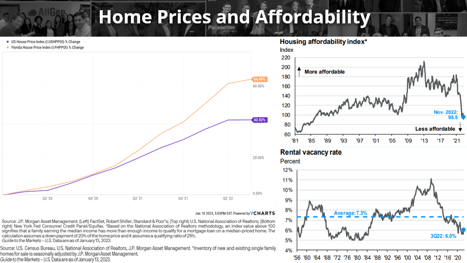
Housing has the largest weighting in the inflation calculation and as seen in the illustration below, housing affordability is at its lowest level since the 1980s. The 30-year mortgage rates have nearly tripled in the last year, largely as a result of aggressive Fed rate hikes. This raises the cost of housing, which reduces consumer spending in other areas of the economy that can ultimately reduce inflation. In the chart on the left-hand side, we see that Florida house prices have surged much more than the US since 2020. Now that homes are much less affordable on average with interest rates much higher than they were, we are beginning to see home prices peak which should come down going forward.
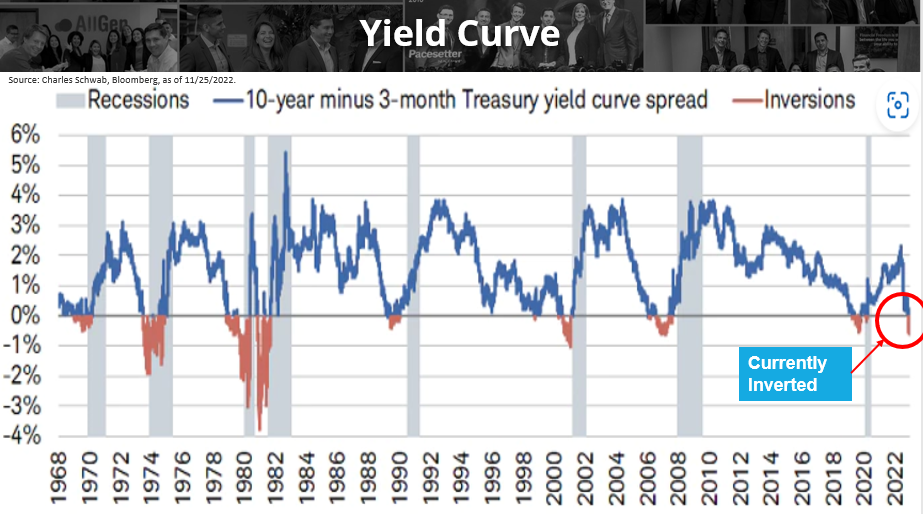
Inverted Yield Curve
The term yield curve is used frequently in market commentaries and is one of several metrics used to determine the overall health of an economy. In normal markets, investors typically demand higher rates of return for investing their money for longer periods of time. For example, an investor purchasing a 30-year Treasury bond would typically want to be compensated more than if they were to purchase a 5-year Treasury bond since it will take longer for the investor to recover the principal. Suppose the 10-year treasury bond is paying a 3% yield, and the 3-month Treasury bond is paying a 4% yield; the yield curve reading would be -1% (3% – 4%).
This phenomenon is known as a negative yield curve or inverted yield curve, which means that investors are now compensated less for buying longer-term bonds than if they were to buy shorter-term bonds. This indicates that the economy is weakening. In the chart below, we chart the difference in yield between the 10-year and 3-month Treasury bonds since 1968. Yield curve inversion has preceded every major recession on record which currently is inverted. Remember that markets anticipate the future and although an inverted yield curve has historically indicated impending economic recessions, whether markets will continue to fall in the future is less certain; we will cover market sentiment later in this article.
More on International Stocks
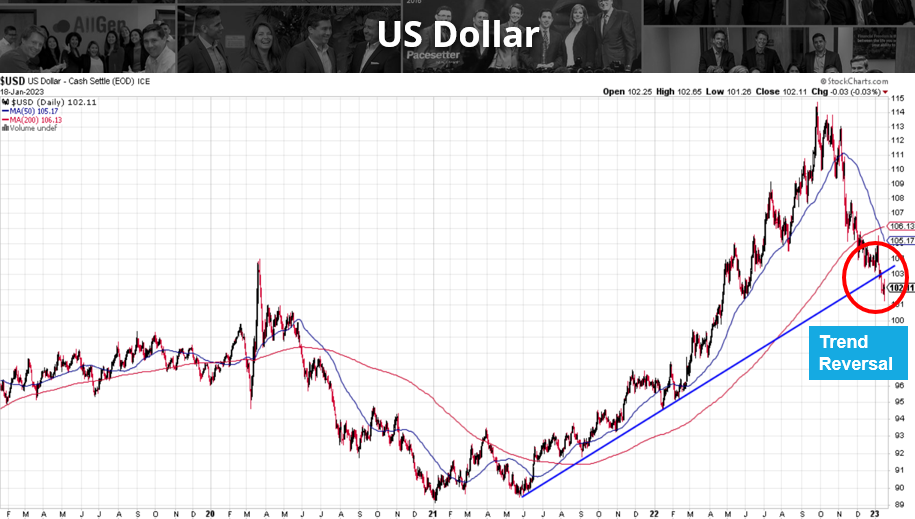
The below chart represents the strength of the dollar which is highly correlated to monetary policy and has now reversed its upward trend. As noted earlier, the Fed has been raising interest rates aggressively which attracts investors and strengthens the dollar. Now that the Fed is holding rates steady with the potential need to lower interest rates sooner than expected, the dollar is weakening. Remember that markets anticipate the future, which is why we’ve seen the dollar begin to decline several months ago.
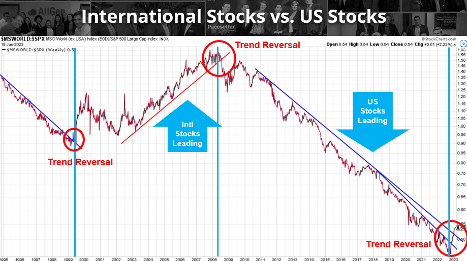
A weakening dollar offers clues that other areas of the world may begin to outperform, particularly international stocks. In the chart below, we examine the relationship of performance between international stocks and US stocks. As the line increases, international stocks are leading and as the line decreases, US stocks are leading. In the bottom right we see a significant trend reversal where we believe international stocks will continue to outperform.
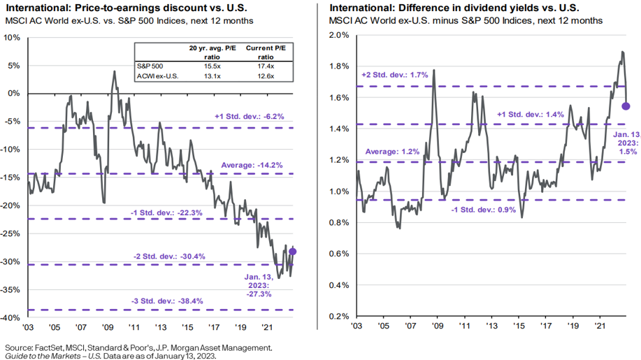
The last two charts offer great technical guidance supporting the outperformance of international stocks. However, it’s important to compare it with fundamental metrics that also support this conclusion. We’ve used the below diagram in the last few market updates that indicate Price/Earnings are at deep discounts to US stocks Price/Earnings, indicating good value. Additionally, see that international stocks are still paying historically higher dividends when compared to US dividends. We have supported overweighting international stocks for several months now, which have begun to outperform. See our October Market Update and even our August Market Update where we point out these relationships.
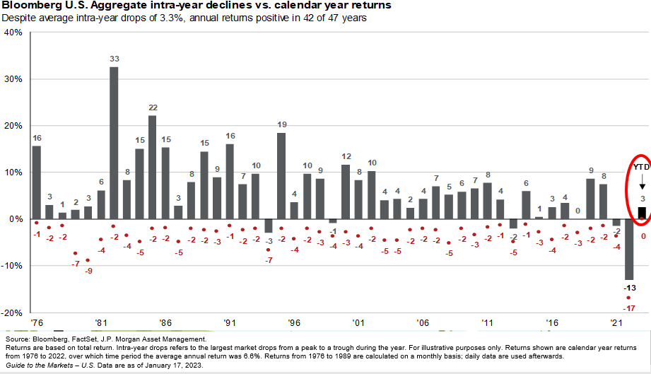
Bonds are another area we believe will recover from historic lows. Below is a familiar chart that illustrates the bond market has historically recovered well in the year following negative returns. In fact, 2022 was the worst year on record for bonds with 2023 already showing signs of recovery.
Low Market Sentiment Indicator
Remember that markets anticipate the future and while economists argue whether we are currently in, or are close to entering, a recession, it’s obvious to say that current market sentiment is very negative. In fact, we can chart it! Below we chart the Panic/Euphoria model which aggregates several different sentiment indicators into one. It covers short interest, margin debt, put/call ratios, and several more (blue line).
We can see that when this sentiment indicator is low, meaning investors are mostly pessimistic, it ironically indicates historically great buying opportunities when comparing it with the S&P 500 (black line). Since the 1990s, when this indicator dropped to extremely pessimistic levels, the market averaged 18.86% 1 year later, 95% of the time! Although the economy is showing signs of weakness in a number of areas, we must continue to consider that markets anticipate the future and that we could already be at a market bottom. We’ve been strategically adding to stocks over the last few months cautiously preparing for this possibility.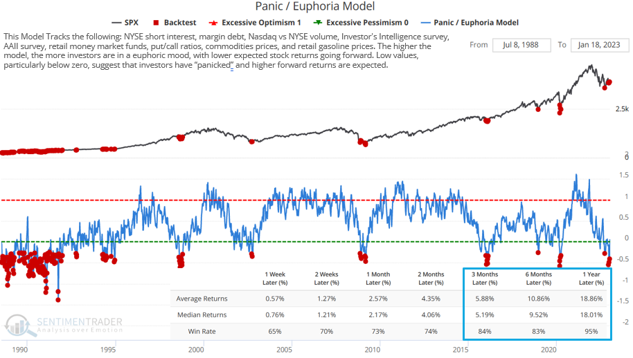
The year of 2022 was no doubt one of the toughest years for money managers and a hard lesson for new investors learning the importance of maintaining a well-diversified portfolio. Markets can be scary, causing investors to make irrational decisions, especially when your life savings are on the line. Removing emotion from the equation and basing investment decisions on fundamental and technical analysis, with a healthy dose of discipline, can offer calm in times of uncertainty.
For more information about how AllGen can invest your money, reach out to an AllGen advisor here!
For more information, watch the full January 2023 Market Update video below.
Important Disclosures: The information provided here is of a general nature and is not intended to answer any individual’s financial questions. Do not rely on information presented herein to address your individual financial concerns. Your receipt of information from this material does not create a client relationship and the financial privileges inherent therein. If you have a financial question, you should consult an experienced financial advisor. Moreover, the hiring of a financial advisor is an important decision that should not be based solely upon blogs, articles, or advertisements. Before you hire a financial advisor, you should request information about the financial advisor’s qualifications and experiences. Past performance is no guarantee of future results. All expressions of opinion are subject to change without notice in reaction to shifting market conditions. Data contained herein from third party providers is obtained from what are considered reliable sources. However, its accuracy, completeness or reliability cannot be guaranteed. Examples provided are for illustrative (or “informational”) purposes only and not intended to be reflective of results you can expect to achieve. AllGen Financial Advisors, Inc. (AllGen) is an investment advisor registered with the SEC. AllGen does not provide personal financial advice via this material. The purpose of this material is limited to the dissemination of general information regarding the services offered by AllGen. The Disclosure Brochure, Form ADV Part II, which details business practices, services offered, and related fees of AllGen, is available upon request.


